It has become increasingly common for typefaces to be created out of a need by a brand. Google (Product Sans), Apple (San Francisco), IBM (IBM Plex), and Netflix (Netflix Sans) are all famous examples of companies who have created a typeface from scratch to unite their brands & products. By developing letterforms from scratch, companies can design for their specific context of use and stylistic genre of their product.
Meet Embroidery Station. Embroidery Station offers products that are unique, modifiable, and personal to each order. So how can one typeface communicate this ideal of tailorability? And how can that typeface relate back to the interlocking, varied shapes of the Embroidery Station logotype without sacrificing readability and cohesive letterforms?
Before the typeface was born, the concept behind Bobbins appeared as a logotype – Embroidery Station needed a new identity that was rhythmic & friendly.
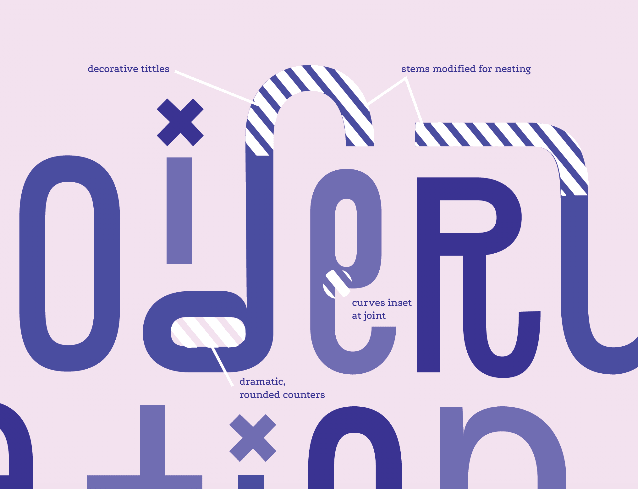
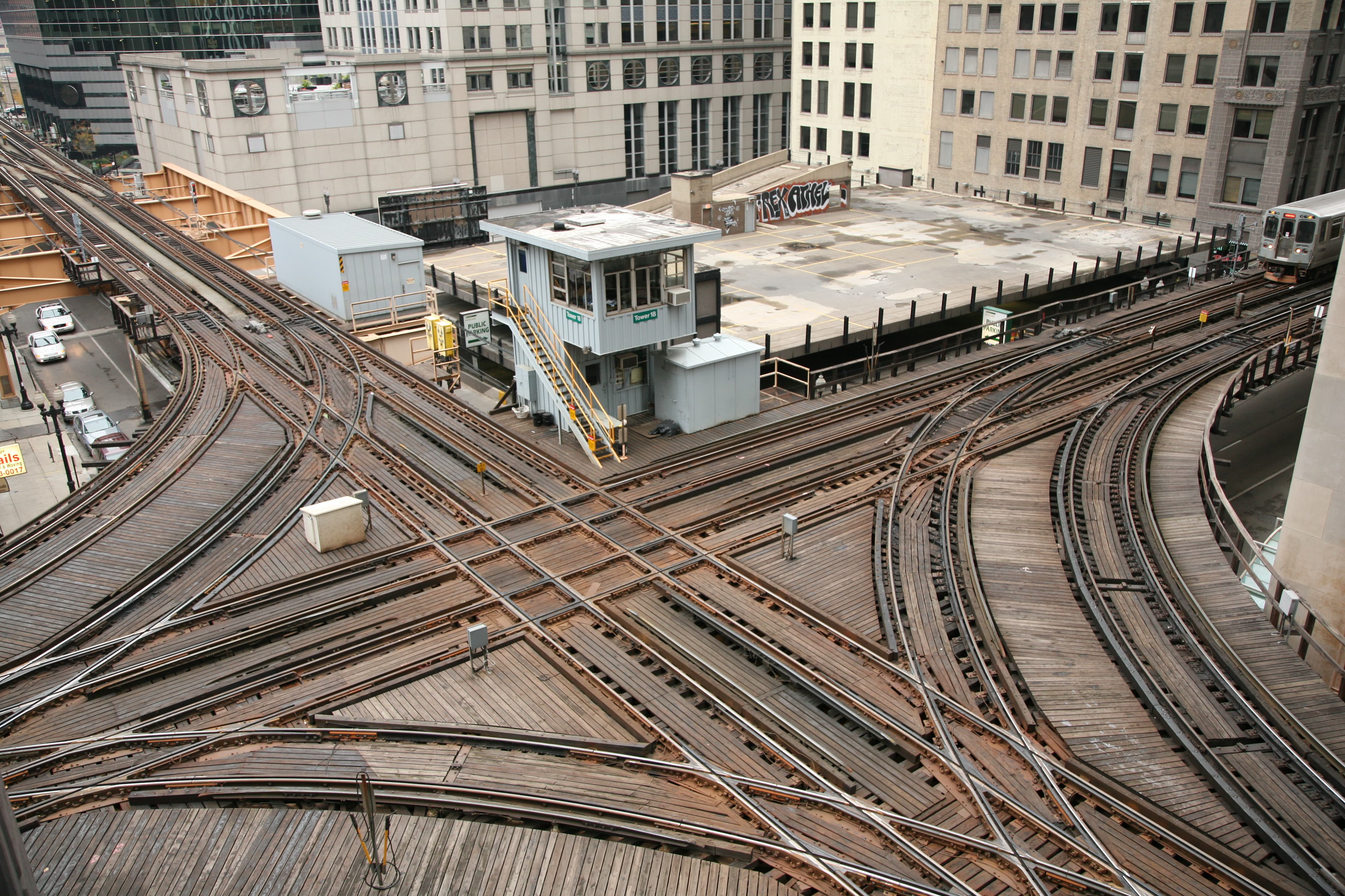
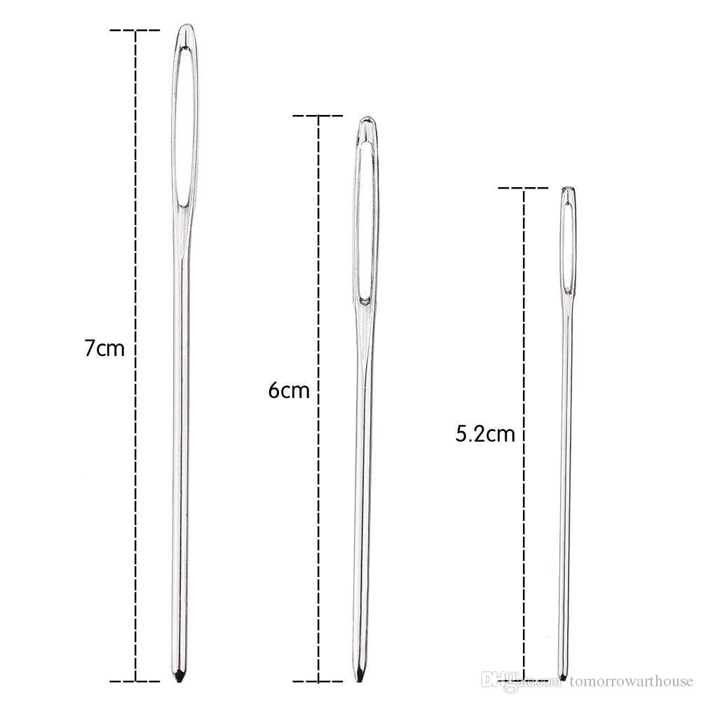
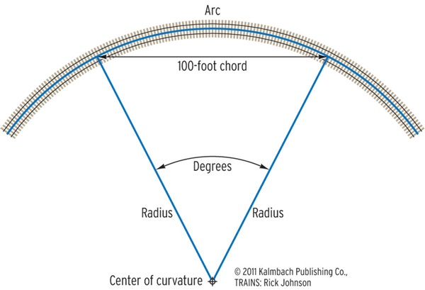
Due to the individuality of the products that Embroidery Station creates, the letterforms had to feel personalized to the viewer rather than appearing to be traditionally spaced out. In homage to the negative space of the needle eye, the final letterforms of Embroidery Station’s logotype were based on the curve radius inside the counter of a needle (often reflected as a long, vertical straight with tight cuves). Aerial views of train tracks served as supporting reference for this rhythm of dramatic curves following a long linear stem.
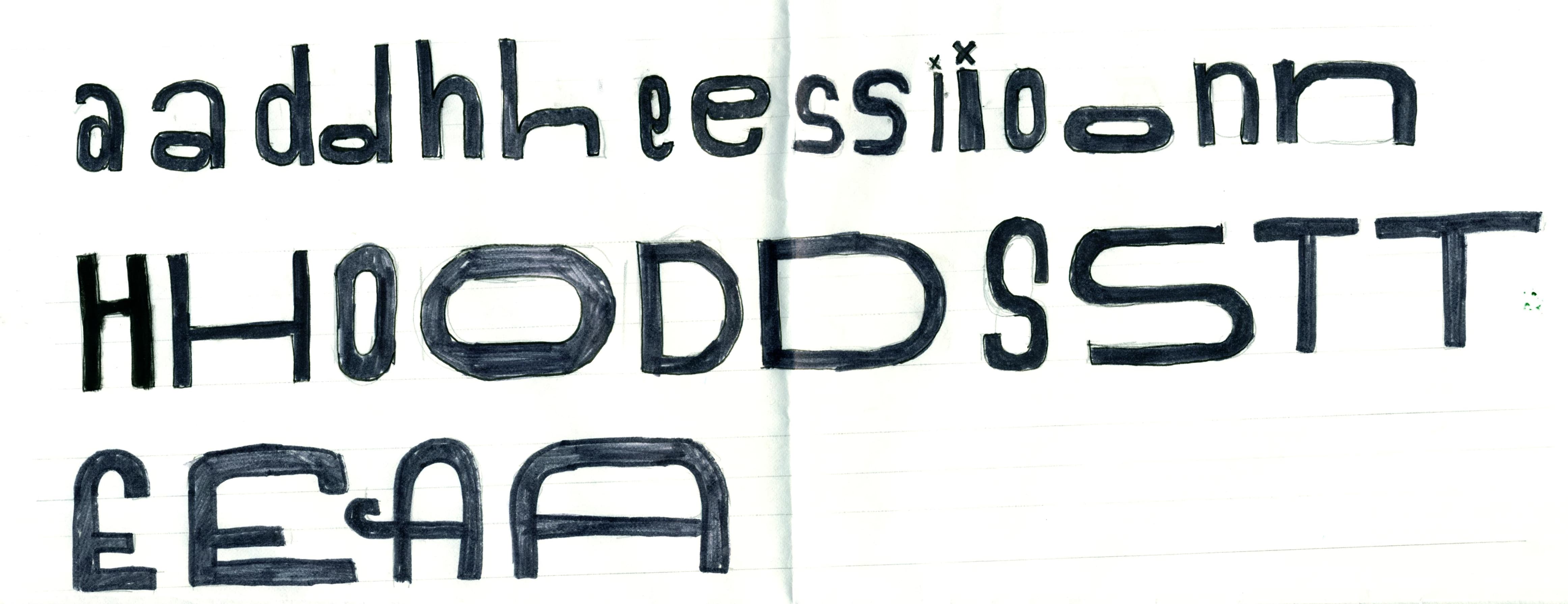
Each letter in the logotype is slightly different from the others, just as every piece created by Embroidery Station is one-of-a-kind. The interlocking letters and warying widths and x-height creates an elegant, personable group of letters that never gets boring to look at.
With the Embroidery Station logotype for reference, the next challenge became to extend the logotype into a fully functioning webfont that could be used on the Embroidery Station website for both display and body text.
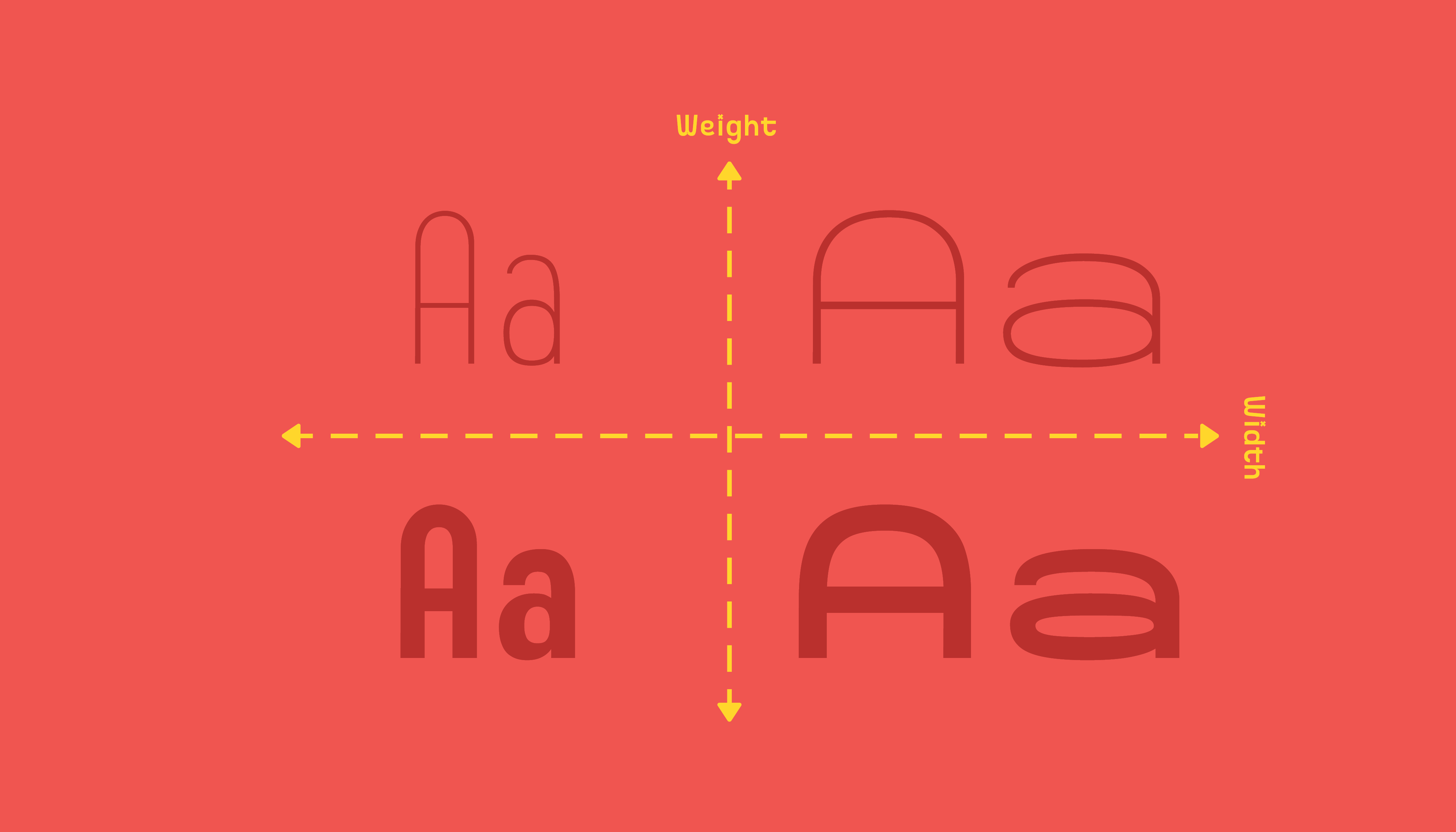
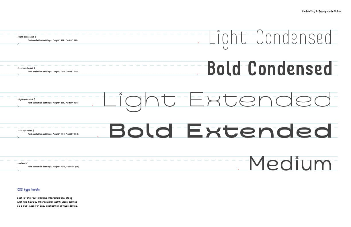
The modifiable weight axis derives from the weight of sewing thread. When using stranded cotton embroidery floss, stitch weight—or the heaviness or lightness of stitch—changes with the number of strands used. Every type of stitch requires a different amound of strands, and the fabric density, needle eye aperature, & tension of the embroidery hoop all affect this choice as well. To match this concept model, the weight axis was used in the development of Bobbins.
Also critical to the handcraft of sewing is stitch length—the physical size of the stitch. The width axis was derived from this effector. If your thread is quite heavy (say, six strands of floss in the needle at once) and your stitches are very small, your fabric may very well pucker, regardless of whether or not your tension on your stitches is correct: the humanist insets apparent at thicker weights in the font are a reflection of this.
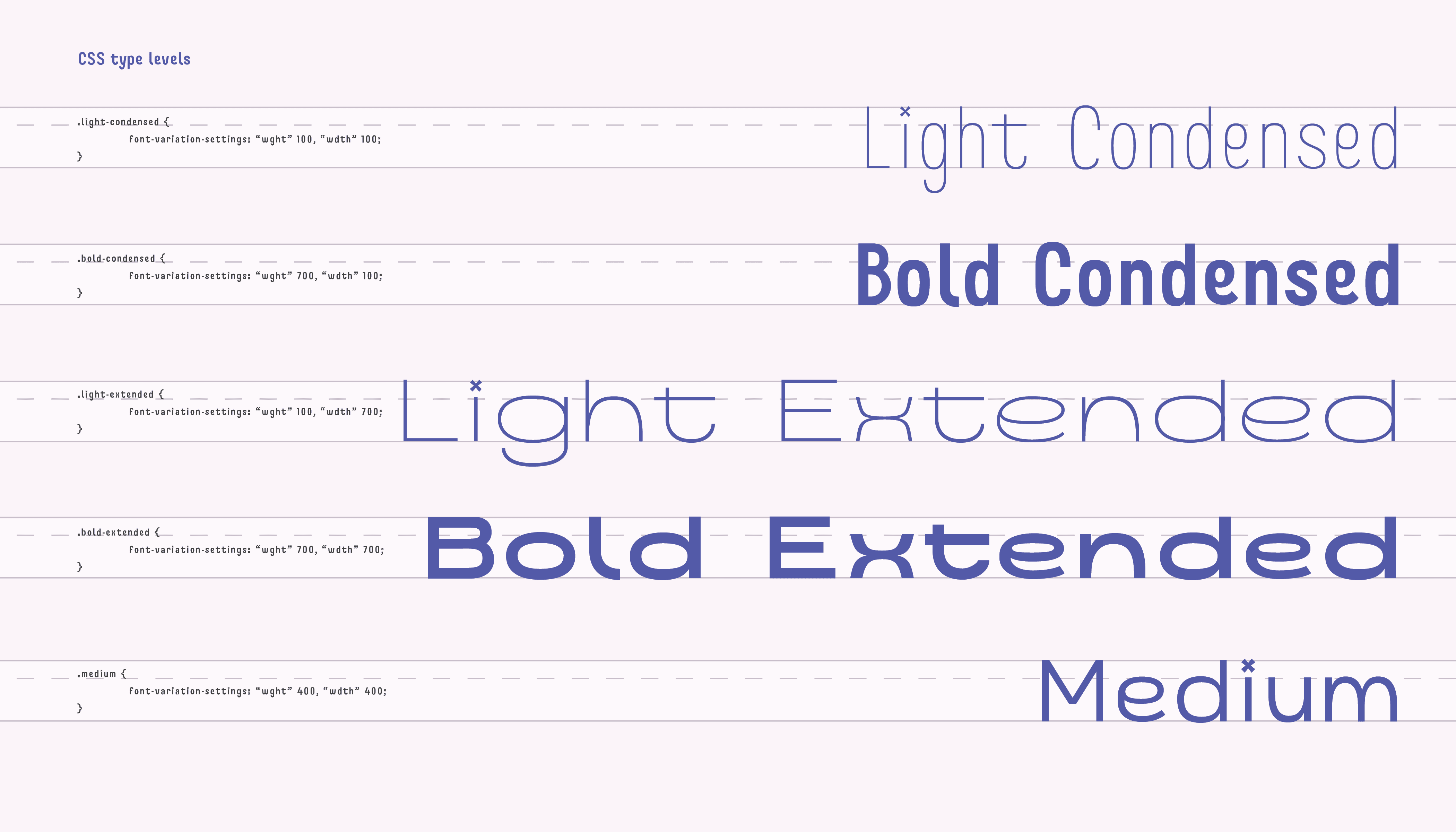
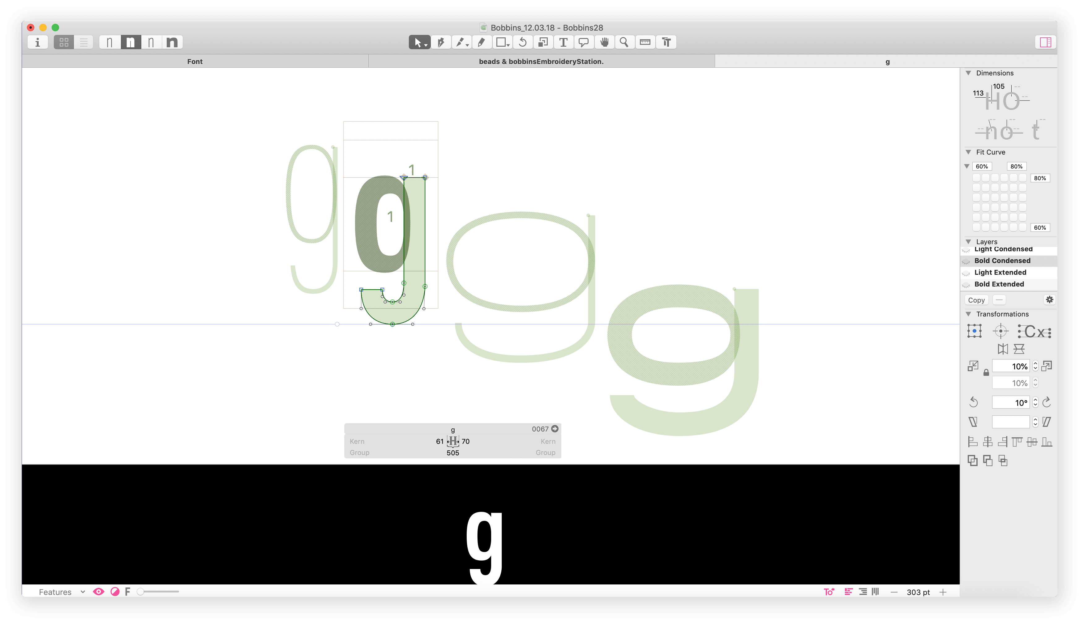
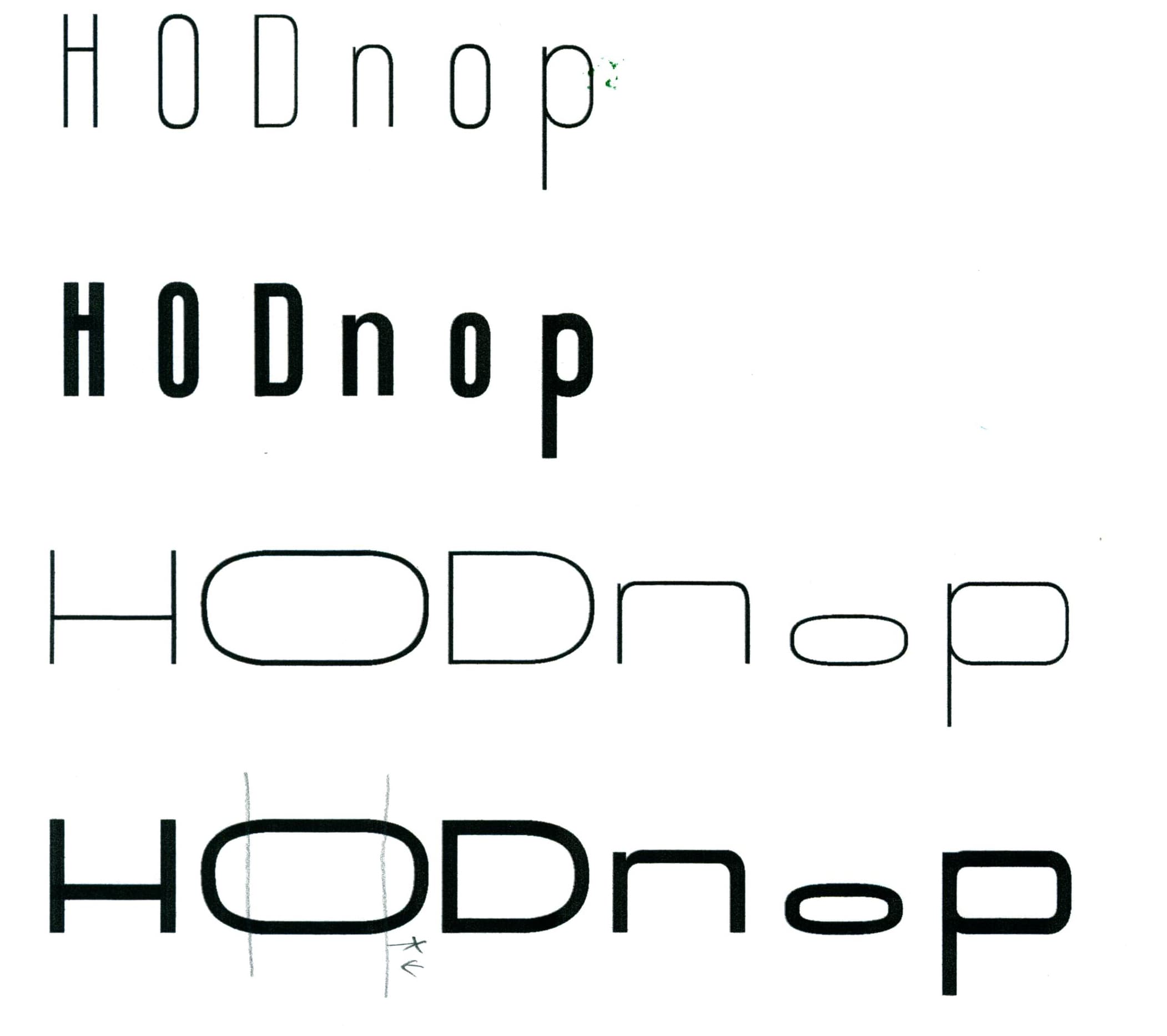
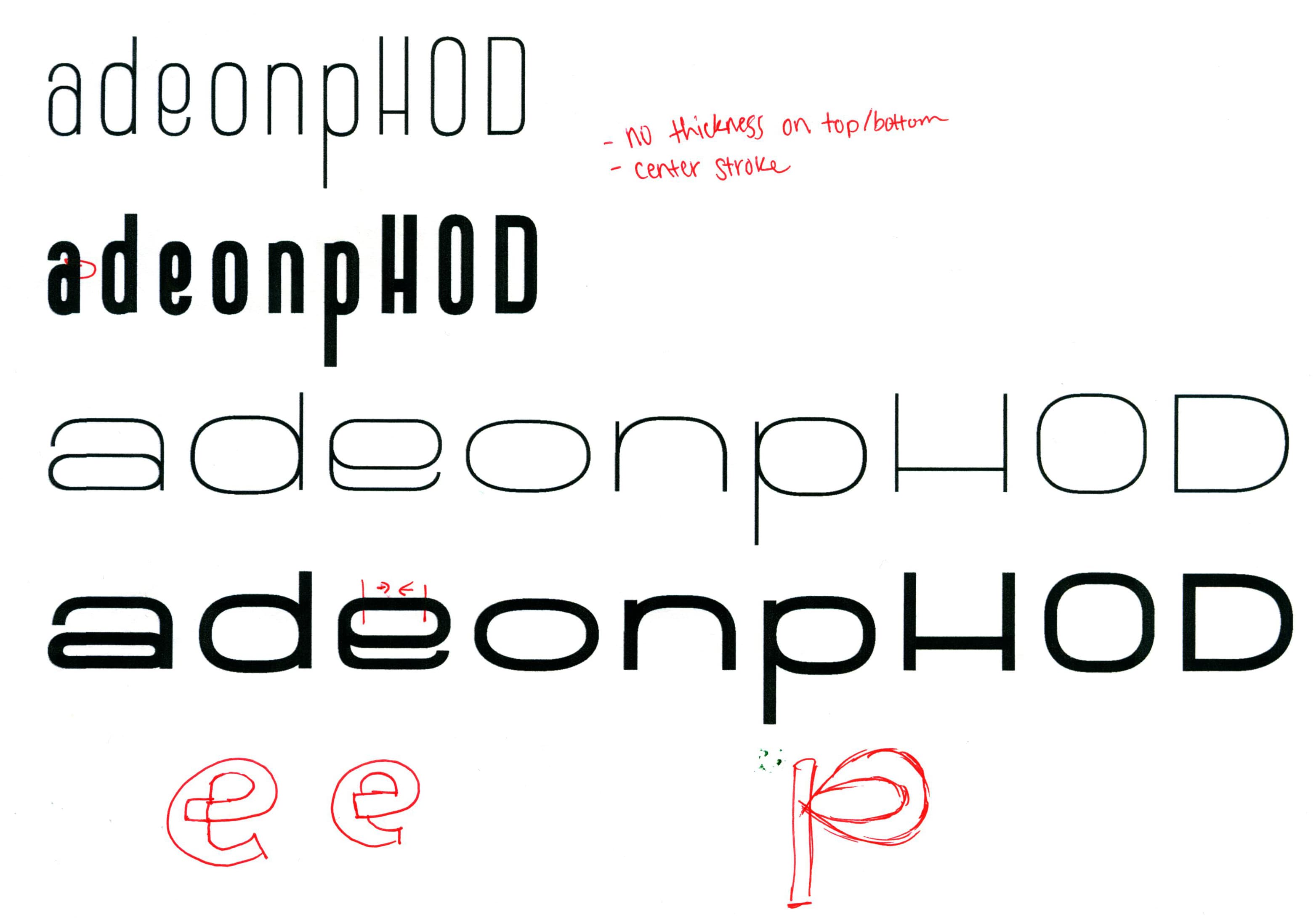
These two modifiable axis resulted in four different masters being created: Light Condensed, Bold Condensed, Light Extended, & Bold Extended. Each glyph must be crafted separately on all 4 masters, and the the Bezier points must remain consistent in number, order, type, & handles across all 4 masters to interpolate correctly.
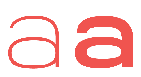
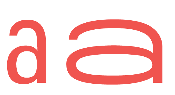
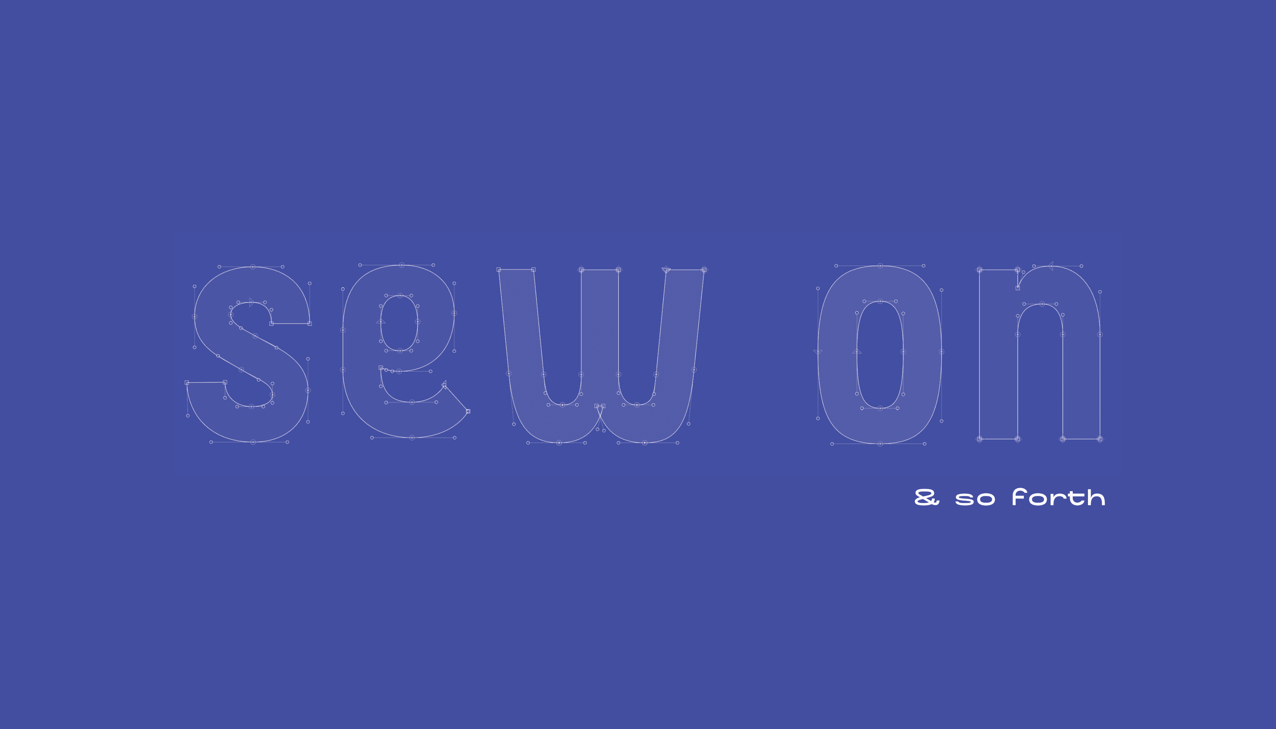
One of the earliest and largest challenges I faced while developing Bobbins was how to handle the softness of curves within the letterforms. In the original logotype, curves were very sharp & dramatic, but as those curves got adjusted along a width axis, the curves started to look more mechanical & scientific, rather than friendly and personalized. This meant that as the letters started to widen, the curves had to greatly soften to appear optically similar to the condensed letter forms.
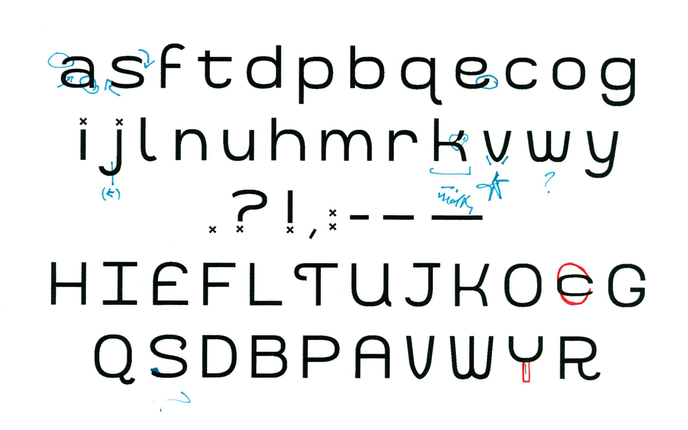
In addition to a standard characterset, Bobbins also implements the use of discretionary ligatures & contextual alternates for added personalization.
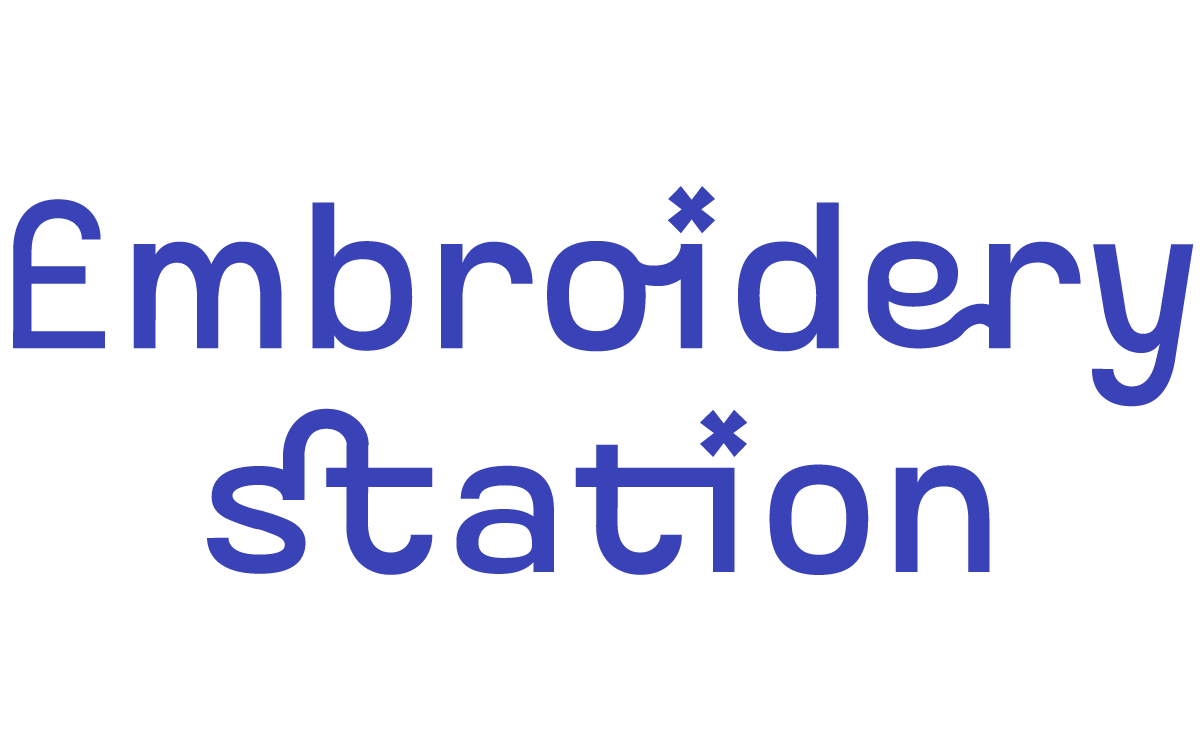
The 4 discretionary ligatures contained in the typeface (st, ti, er, oi) reference back to the connectivity of embroidery thread when it is used to stitch letters. The thread remains unbroken between letters for effeciency and is removed after the stitching is complete.
A contextual alternate for “E” was also included in the typeface. When “E” is paired next to “M” (Em), it becomes stylistically curved to match the original Embroidery Station logotype.
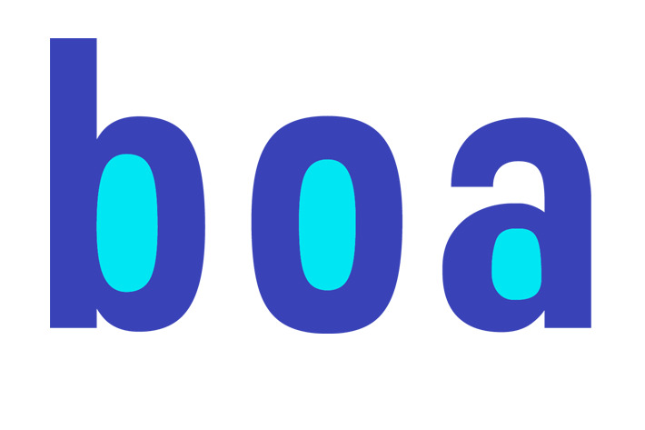
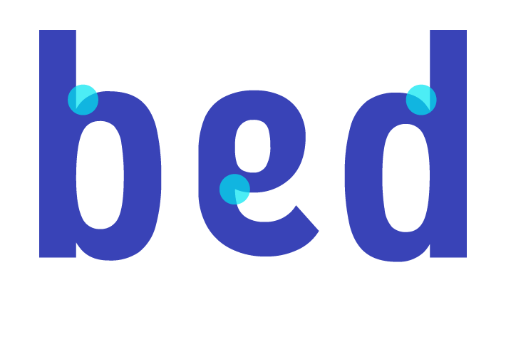
Its counters reflect the widening and narrowing of a needle eye as the needle length extends or decreases.
The inktraps at joins reflects the way that stitches pillow and puff on fabric.

Punctuation marks and tittles originate from the cross stitch, one of the simplest marks in embroidery.