As part of a 5-person team of interns at AKQA in Washington D.C., I worked collaboratively to research client insights, concept creative ideas, and produce deliverable assets.
Kira Porter Project Manager
Jerry Wertheim Strategist
Sarah Riedlinger Designer
Brooke Smith Technologist
Gillan Johnson UX Designer
The internship period was 8 weeks long, with the first 4 being spent on broad campaign ideas and brainstorming. After pitching our top 2 creative directions to our client, we proceeded with a final execution in the last 4 weeks while taking their feedback into account. This project allowed me to discover how design fits into a broader process on a larger team, and taught me how to iterate quickly in order to produce a comprehensive campaign.
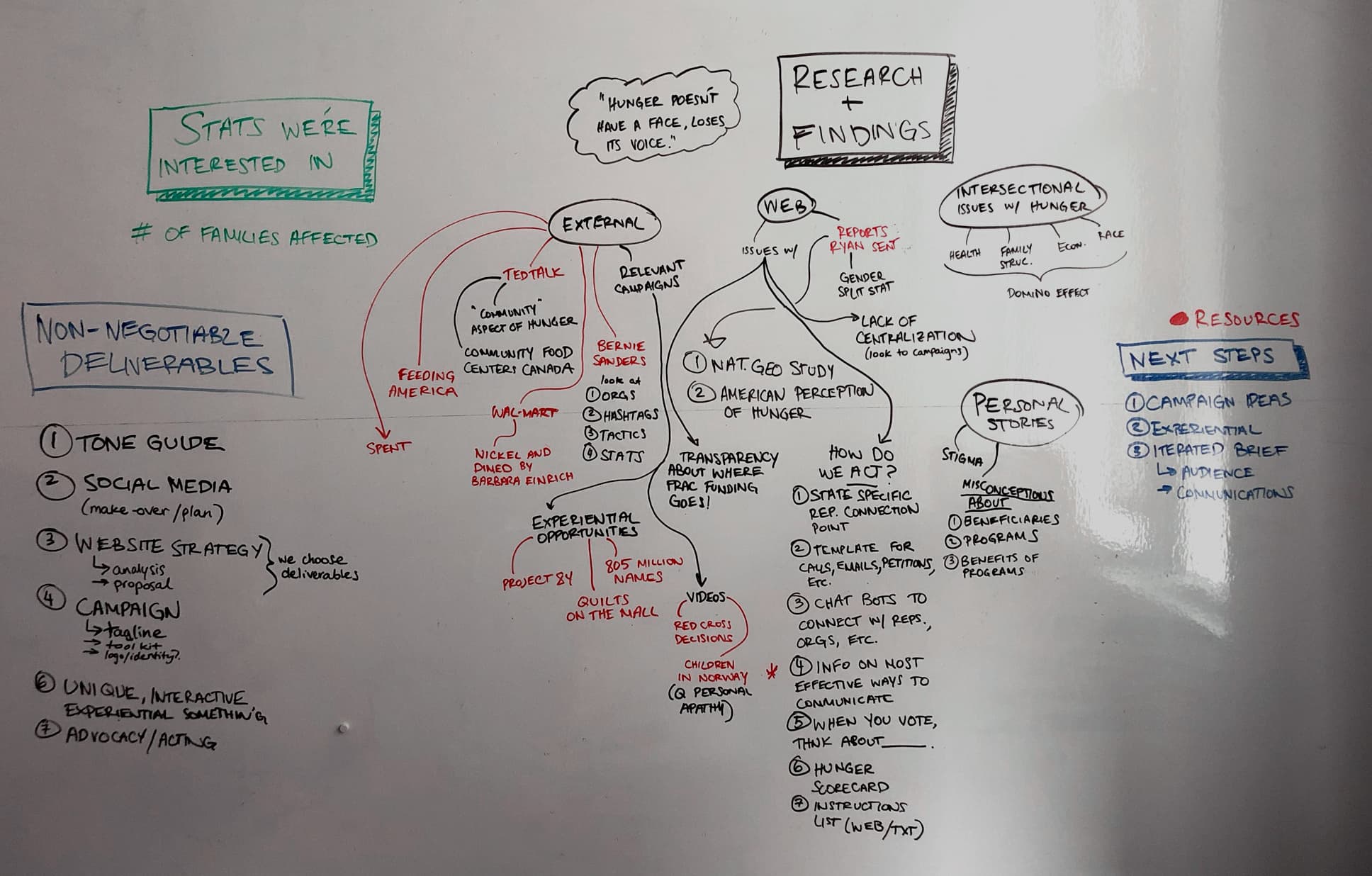
Research
Insights
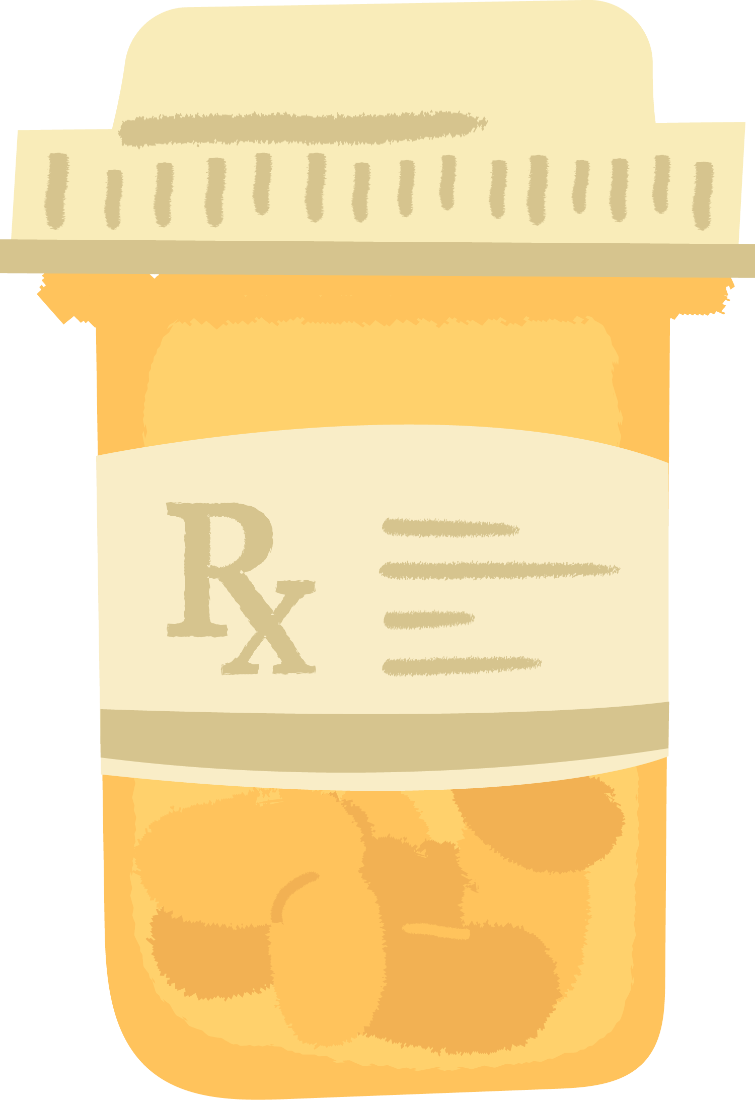
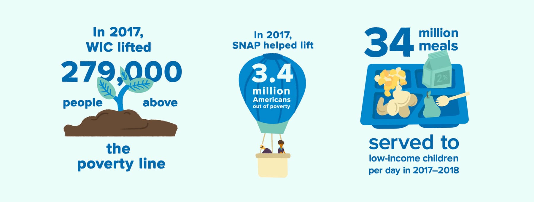
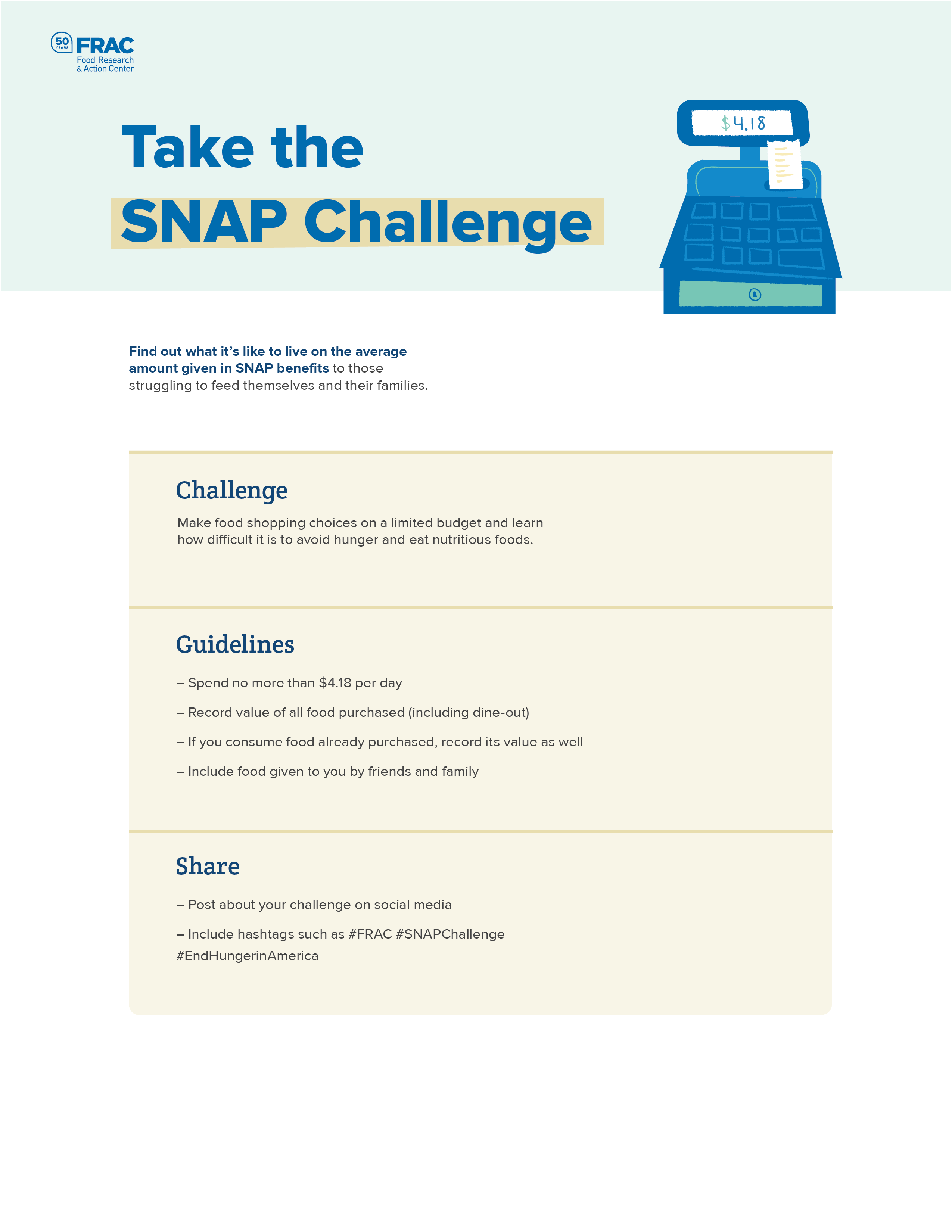
1 in 6 Americans rely on SNAP benefits (food stamps) to feed themselves or their families.
Hunger is a hidden issue because it is different from starving; there is often no physical indication that a person occasionally skips meals due to food insecurity.
The more local hunger becomes, the less inclined Americans are to believe it exists. Most Americans agree that hunger is a problem in the country, but much fewer believe it directly affects their local communities.
Challenges
Delivering the harsh reality of hunger while also celebrating the help that FRAC has provided the past 50 years
Overcoming apathy and desensitization of the general public to hunger
Bridging the gap between empathy and advocacy by creating measurable actions (FRAC has no need for monetary donations)
Key Inclusions
Celebrate FRAC’s role as the watchdog of essential nutrition programs for 50 years
Hunger can be solved and FRAC has a roadmap to do so
Campaign Direction
After presenting two initial campaign ideas to our client, we adapted their feedback into their preferred direction and landed on the main idea that would fuel the execution of our deliverables.
The Idea
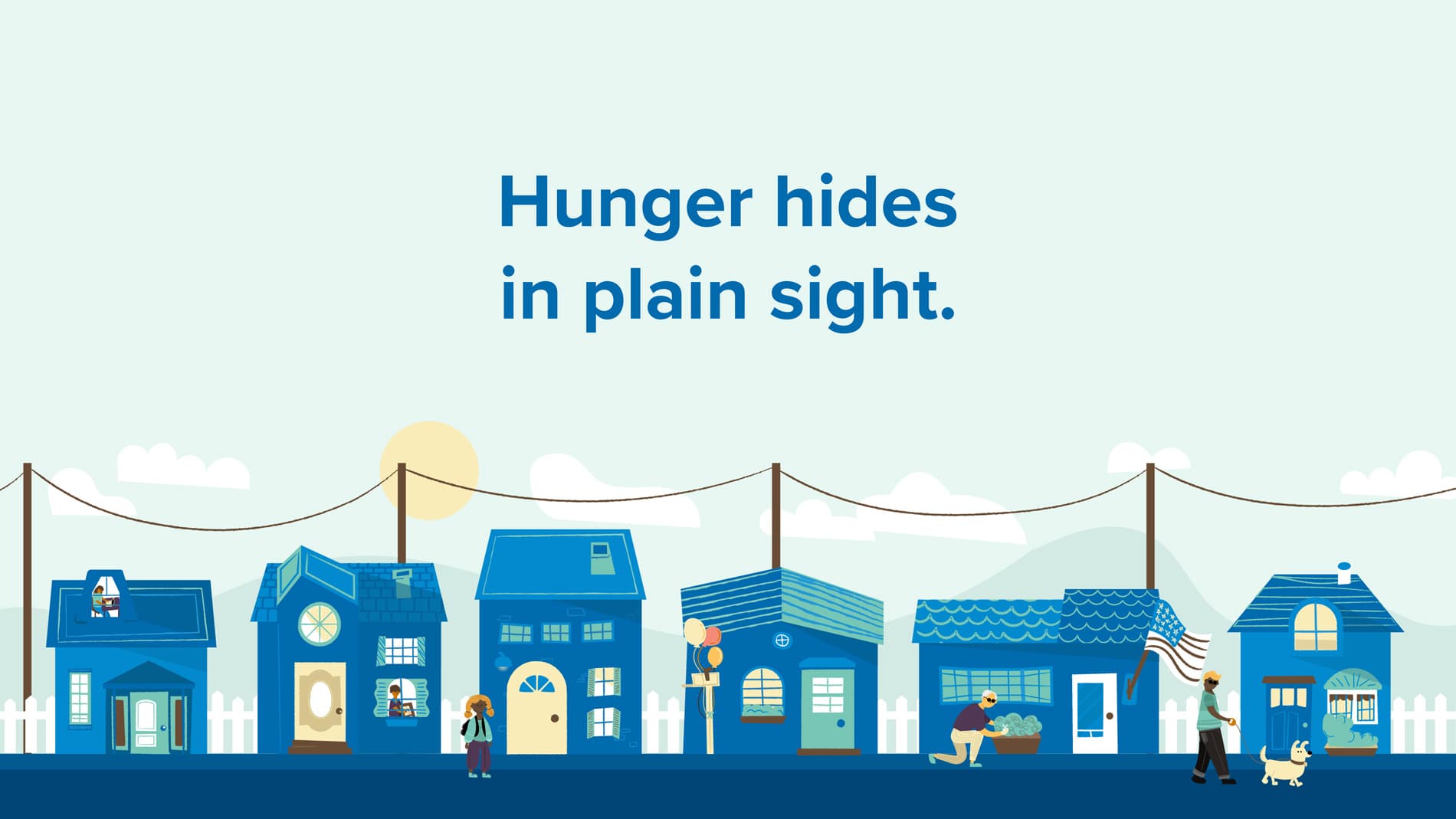
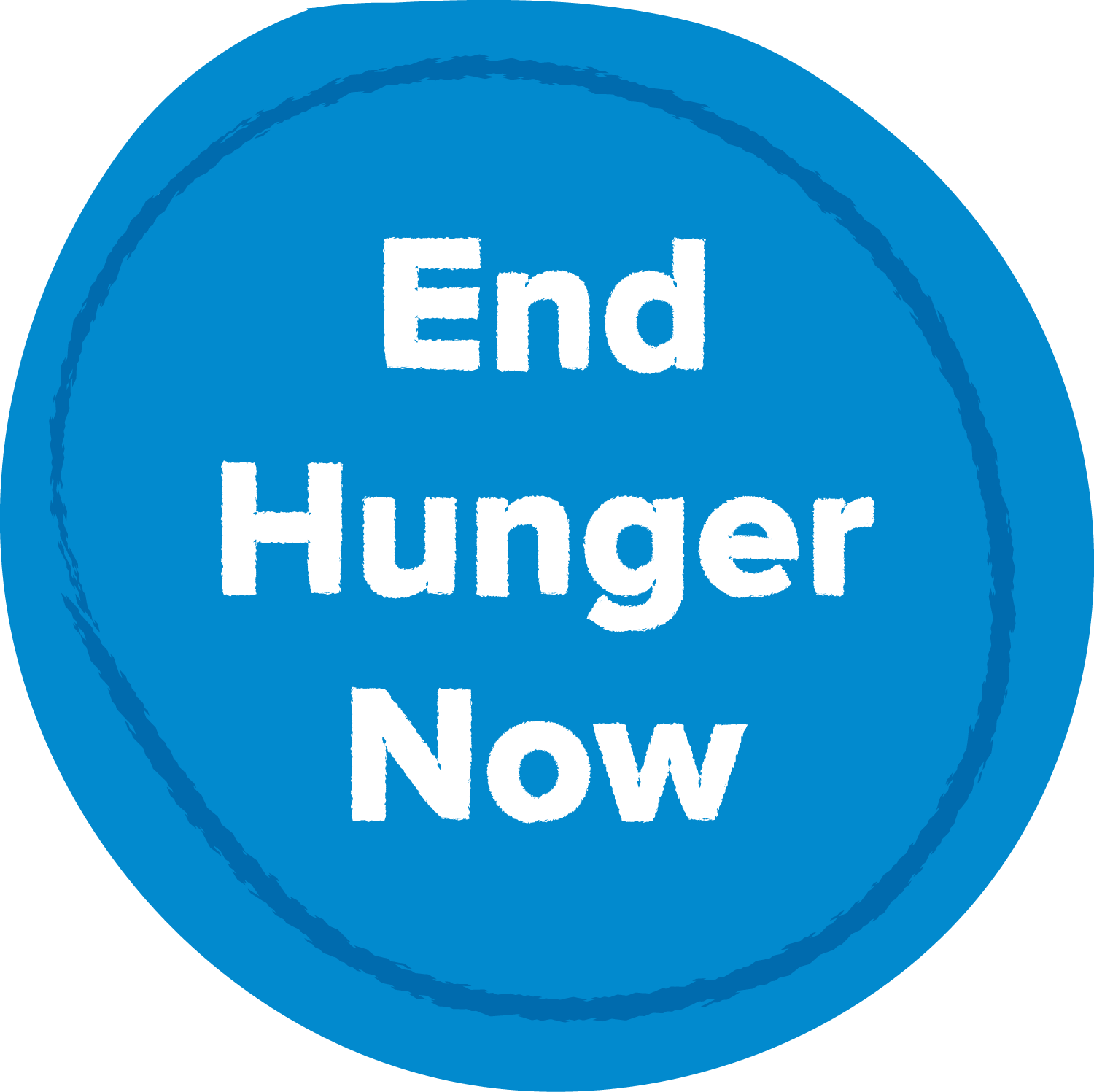
Hunger hides in plain sight.
Campaign Tone
Humanistic
Compassionate
Intimate
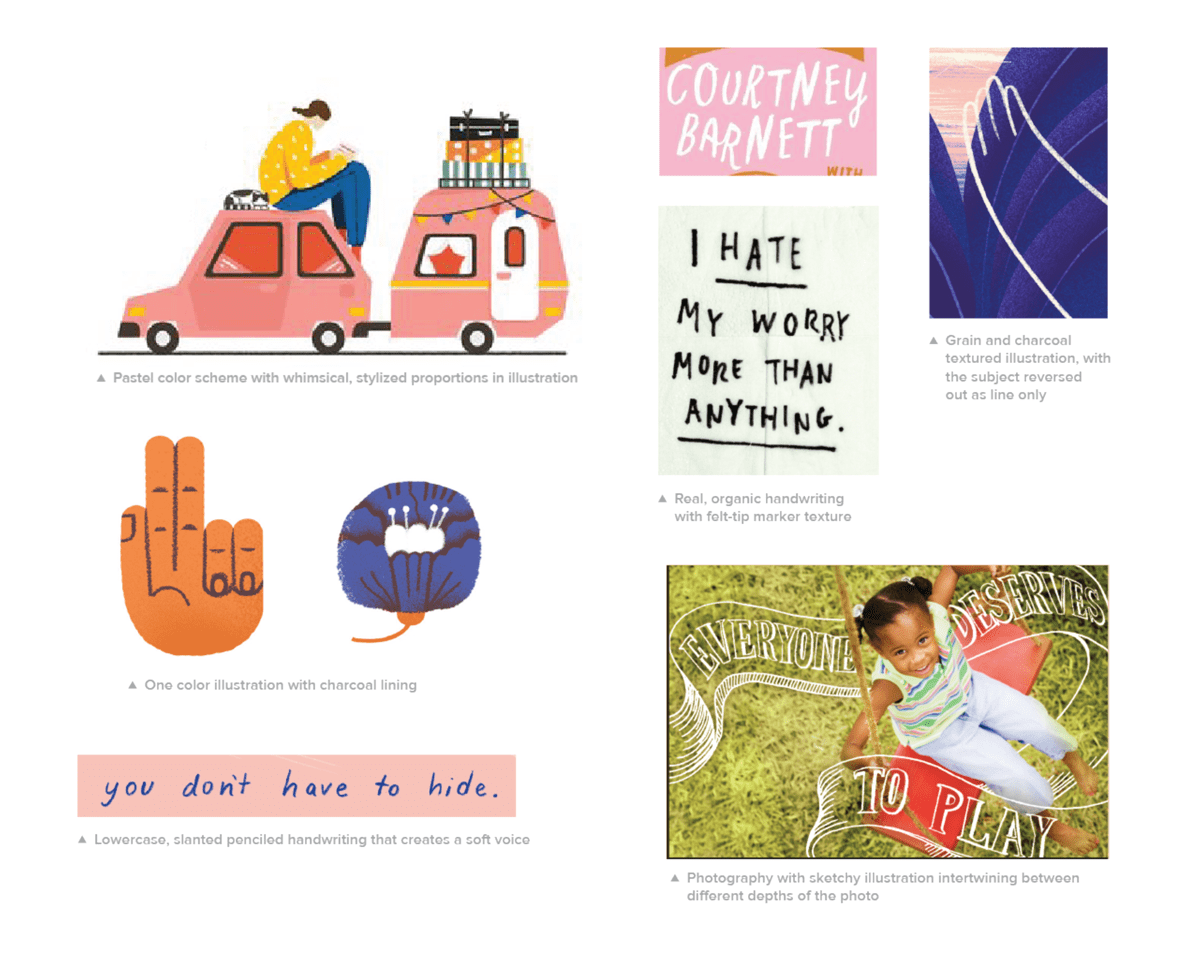
Moodboard
Before creating any visuals, I curated a moodboard that specifically highlighted aspects of illustration and type styles that could be successfully implemented to communicate our campaign tone.
Why this Works
Narrative-focused approach ties audience to local community
Personal stories highlight relatable intersectional issues
50th Anniversary Identity
Colors
We chose the blue from the FRAC logo as the primary color because it is both bright and calming; bright to draw attention and calming to soften a difficult topic. Building off the FRAC blue, we chose additional shades of blue that allowed us to add depth to the illustrations. From the secondary color palette, we chose gold, which complemented the previous blue selections and adds a celebratory feel to the palette.
FRAC Blue
FRAC Dark Blue
Light Blue
Teal
Pale Yellow
Beige
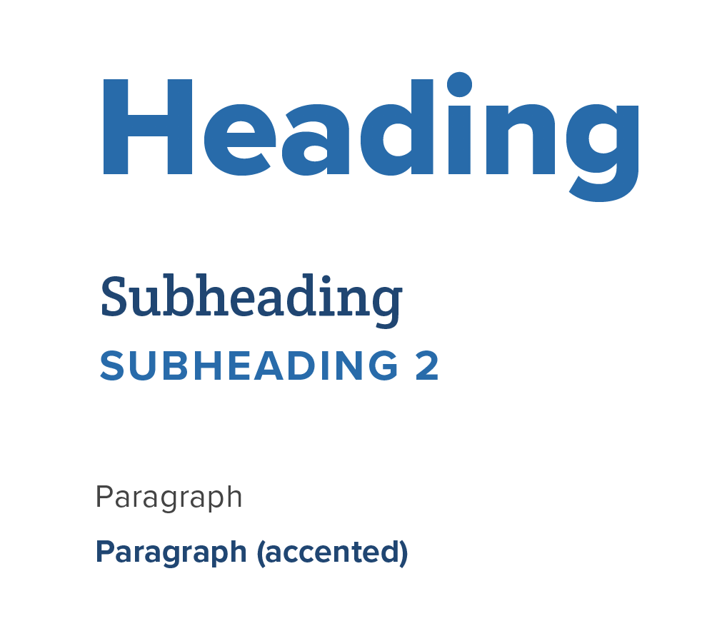
Type
The headline typeface is Crete Round, which is available on Google Fonts for free, making it easy to use throughout print and web branding in the future. Crete Round’s thick slabs add visual interest and eccentricity in a large-scale setting. The slab-serif also contrasts well with Proxima Nova, which is the serif font used in FRAC’s current branding. This combination of new and old unites FRAC’s existing identity with the 50th landing page content.
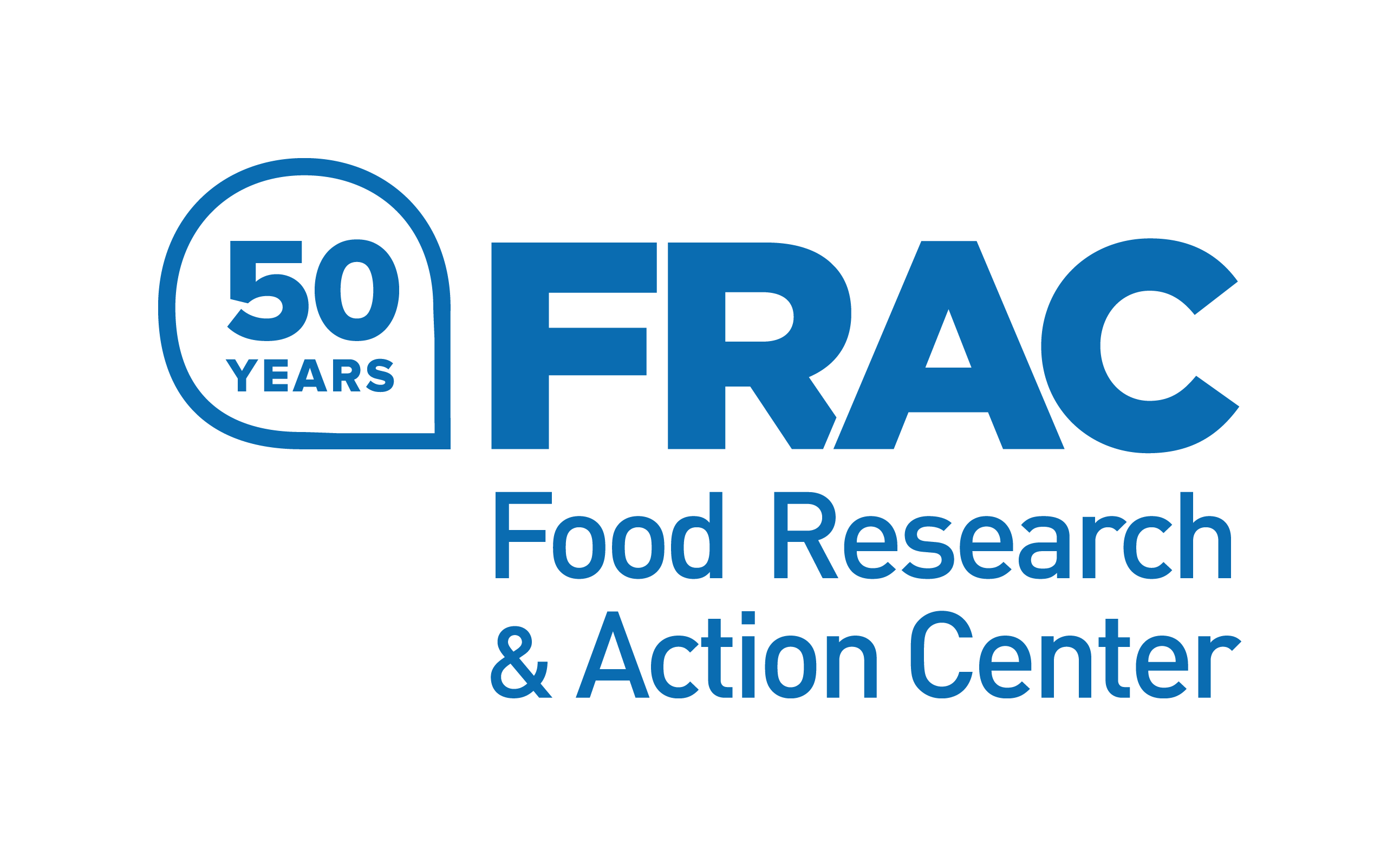
Logo
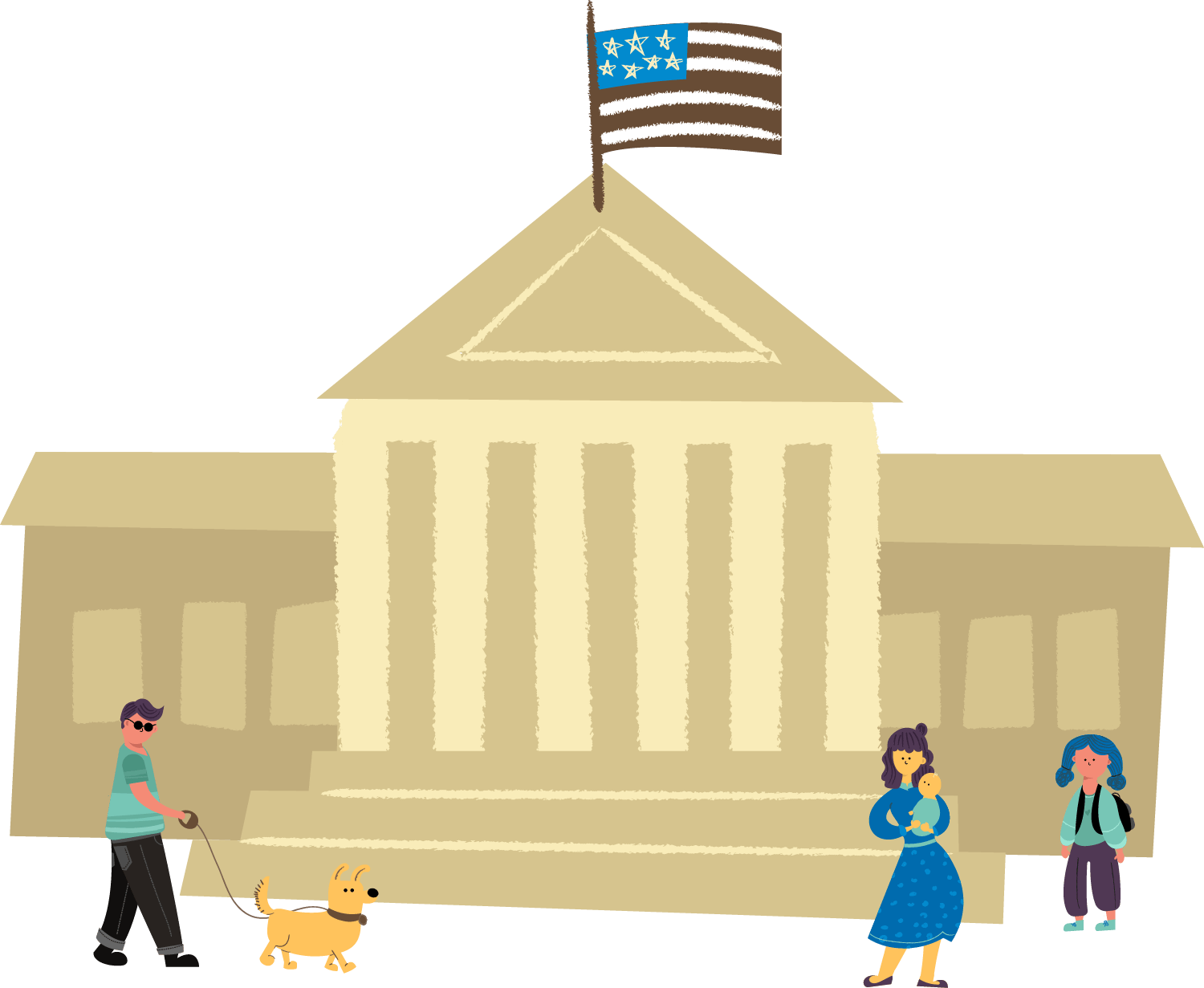
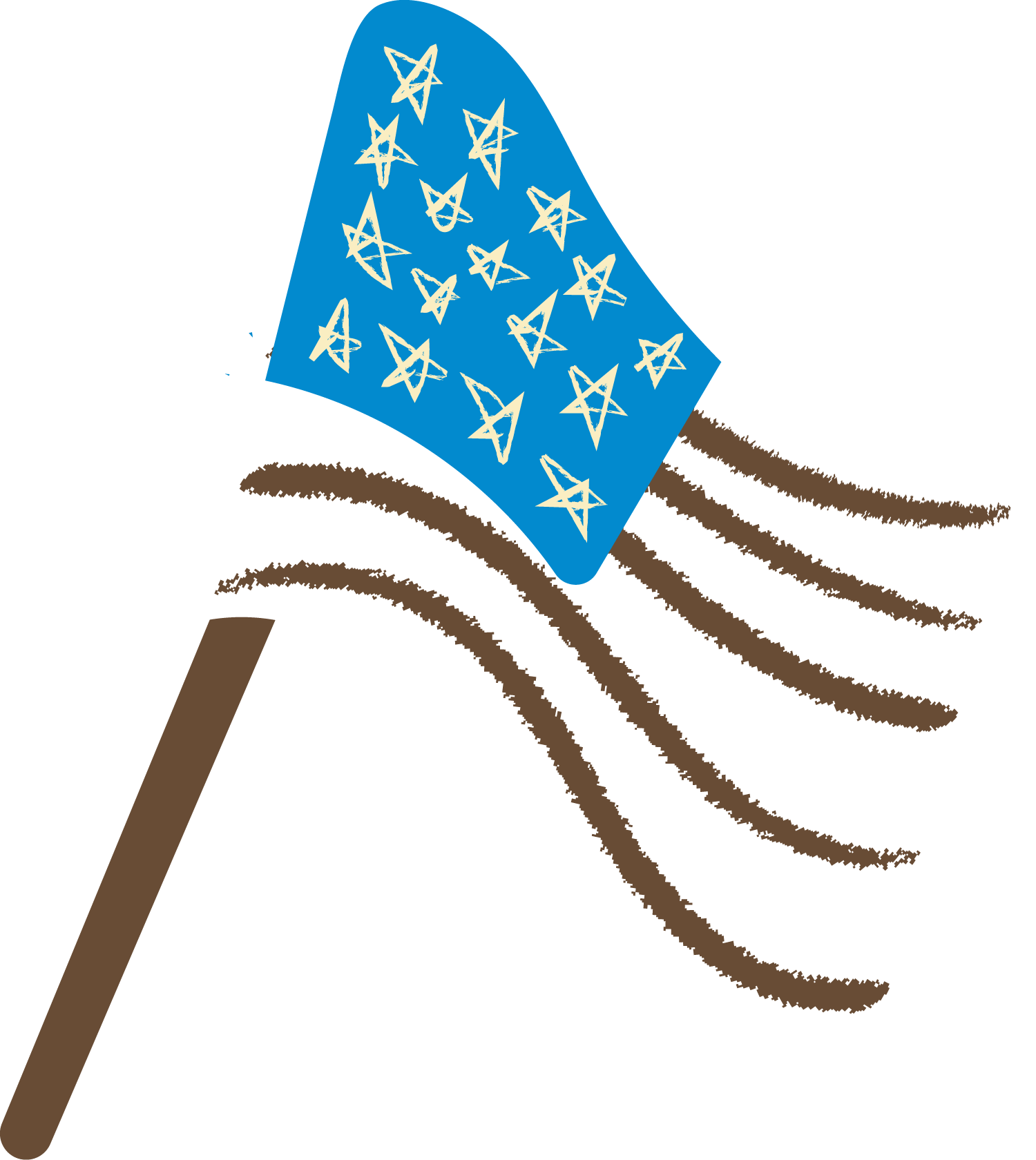
We constructed a mark add-on that nests against the straight counter of the “F” in the existing FRAC logo. The mark is made up of an abstract icon we call the “advocacy bubble,” along with type announcing “50 years.”
The advocacy bubble is an organic shape that takes inspiration from a speech bubble and speaks to FRAC’s advocacy for Americans and federal nutrition assistance programs. It references the quote and narrative-based approach that we used for the campaign and landing page. The advocacy bubble shape is also used for the call-to-action button on the landing page, with the pointed end helping to communicate literal direction towards the advocacy page.
Main logo with exclusion zone and grid alignment displayed
Vertically stacked, unmodified width wordmark with icon
Horizontally stacked wordmark with icon
Icons
In settings where the FRAC brand has already been established, particularly internal settings, the icon can be used on its own.
FRAC Blue
Black on white
White on dark backgrounds
Dark on light backgrounds
Character Creation
Illustrations allow for more universal empathy, as we connect our own experiences to them more readily than with stock photos. Illustrations can also help elevate FRAC’s brand as a whole by providing unique visual consistency across content. Any organization can use stock photos, but this illustrative style is completely unique to FRAC and is instantly recognizable while scrolling through one’s social media feed.
Developing personas
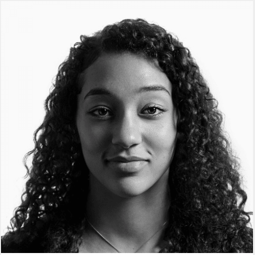
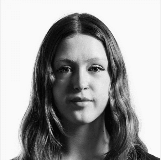
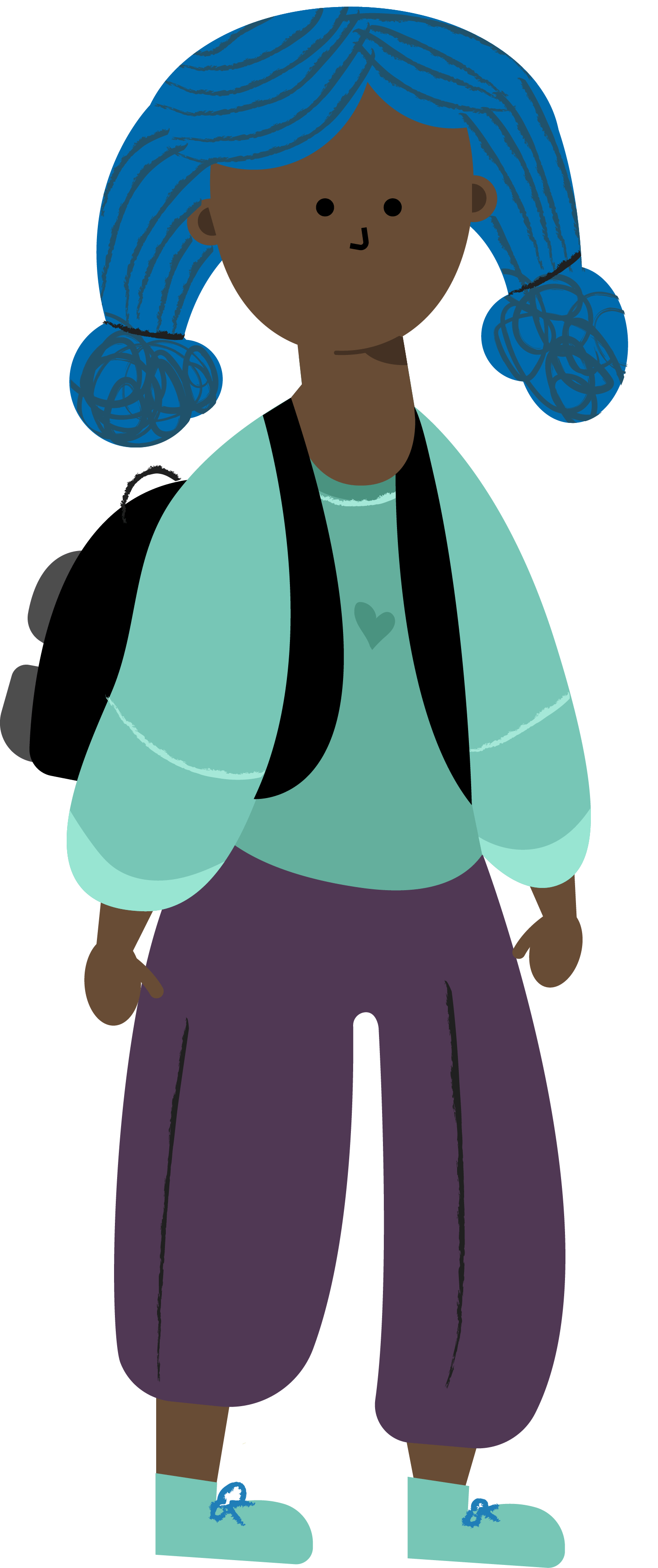
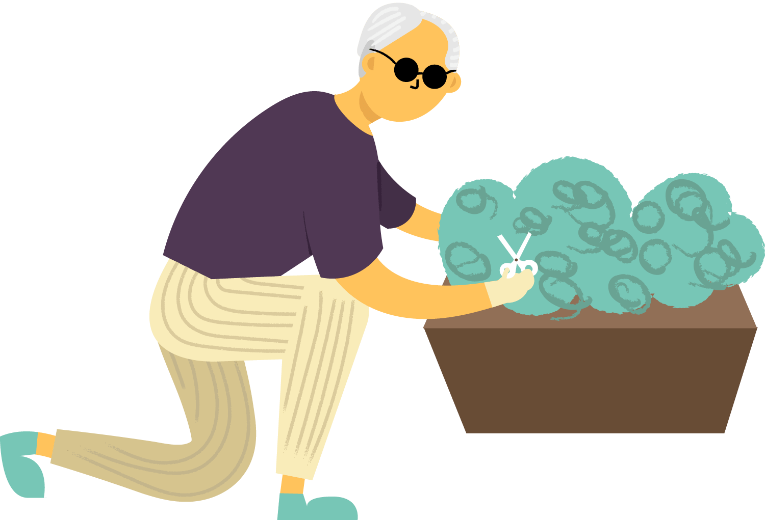
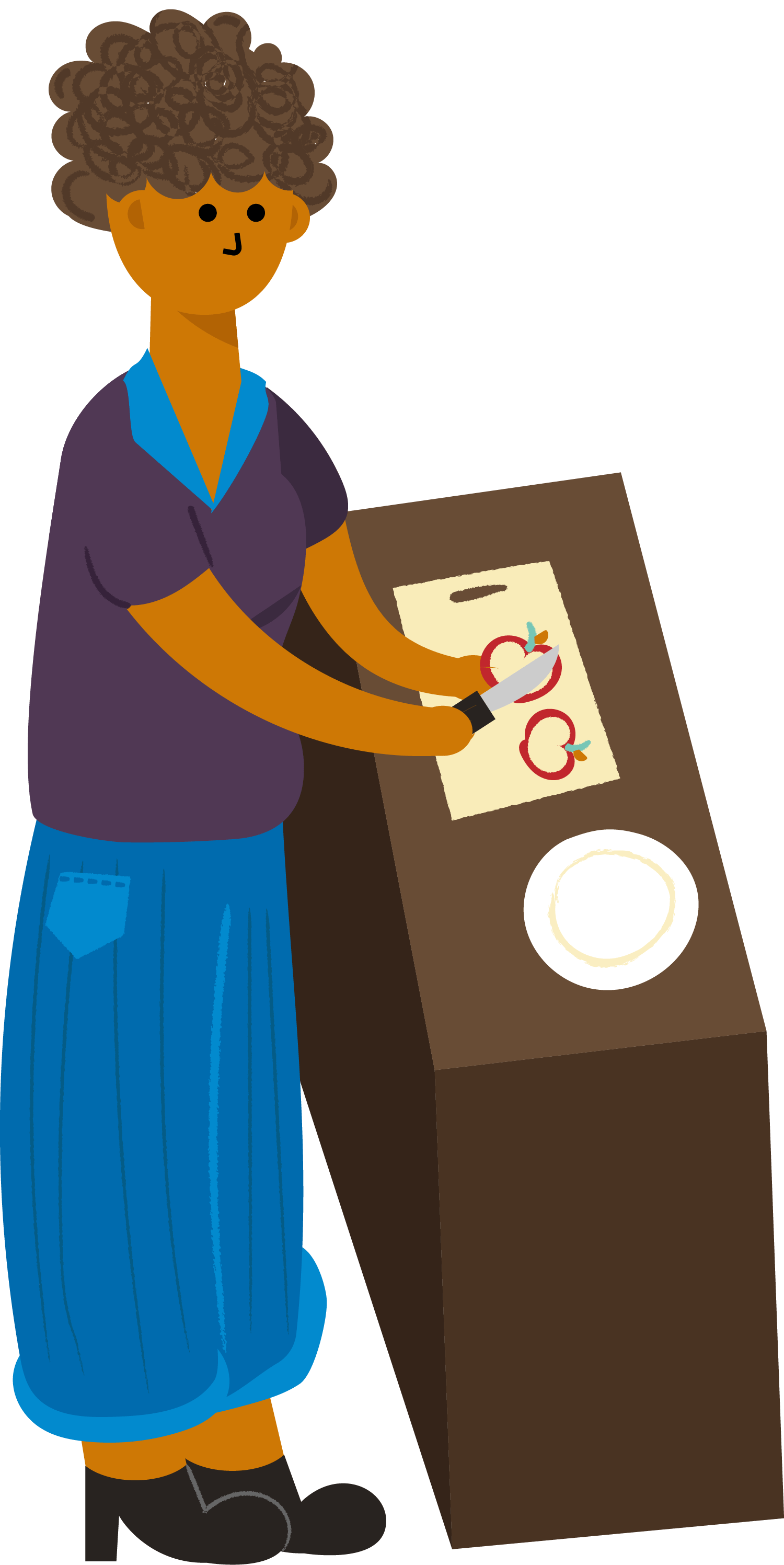
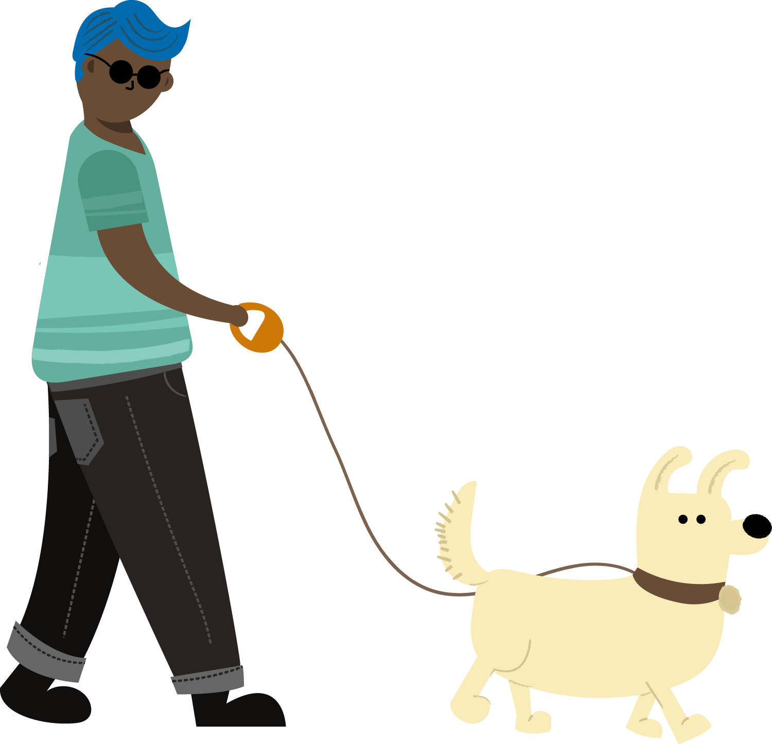
In order to create reusable illustrated assets while showcasing human stories, we pulled from real narratives in our research to create six different characters. All of our characters are based on people who experienced hunger due to different intersectional issues, but whose lives were improved by the programs that FRAC advocates for.
Sherry School Meals
Natasha WIC
Robin SNAP, School Meals
Mark SNAP, Elderly Feeding Program
Kathy WIC
Walker Supporting Character
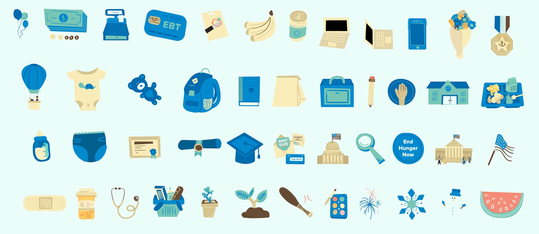
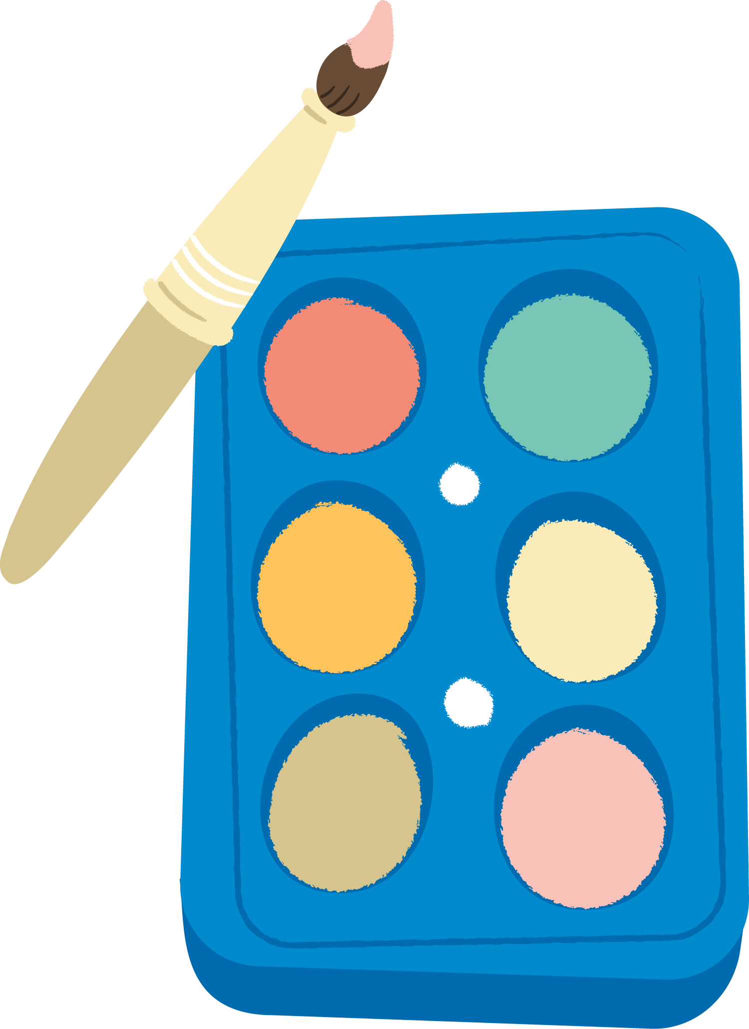
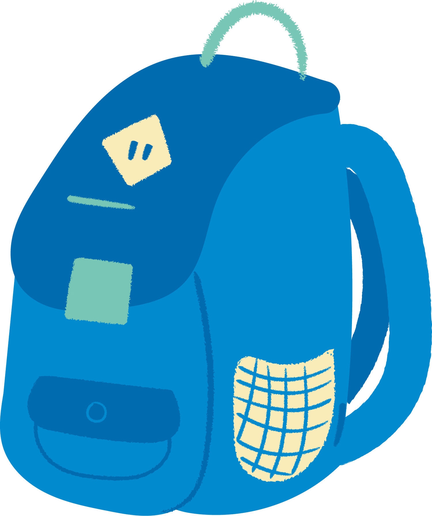
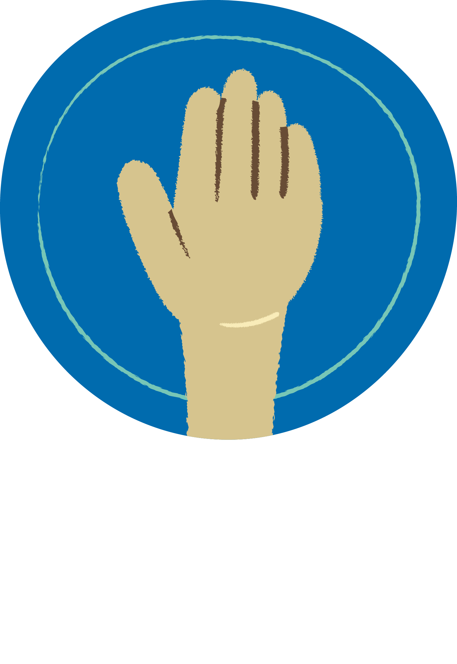
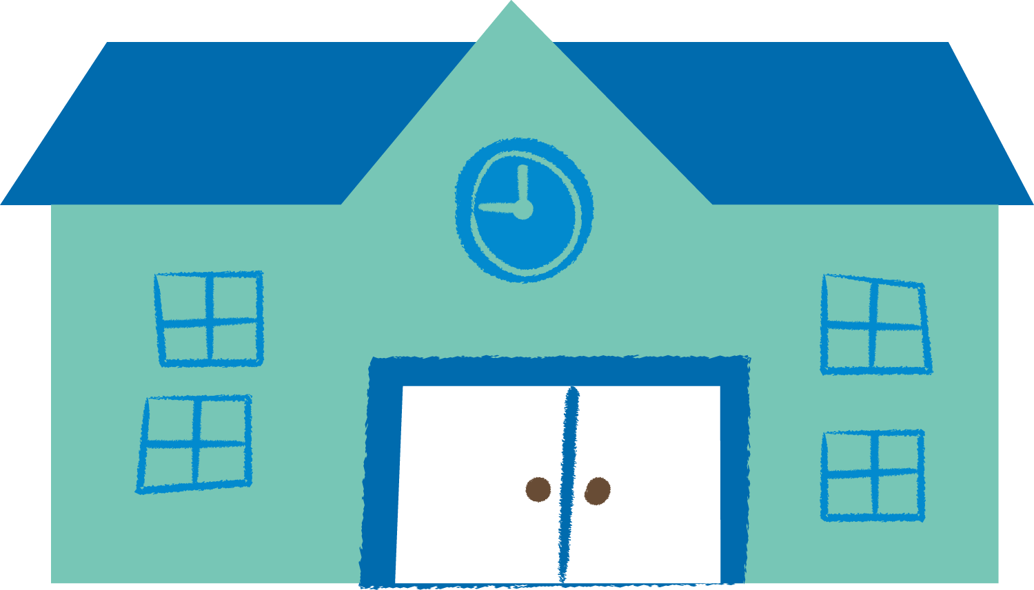
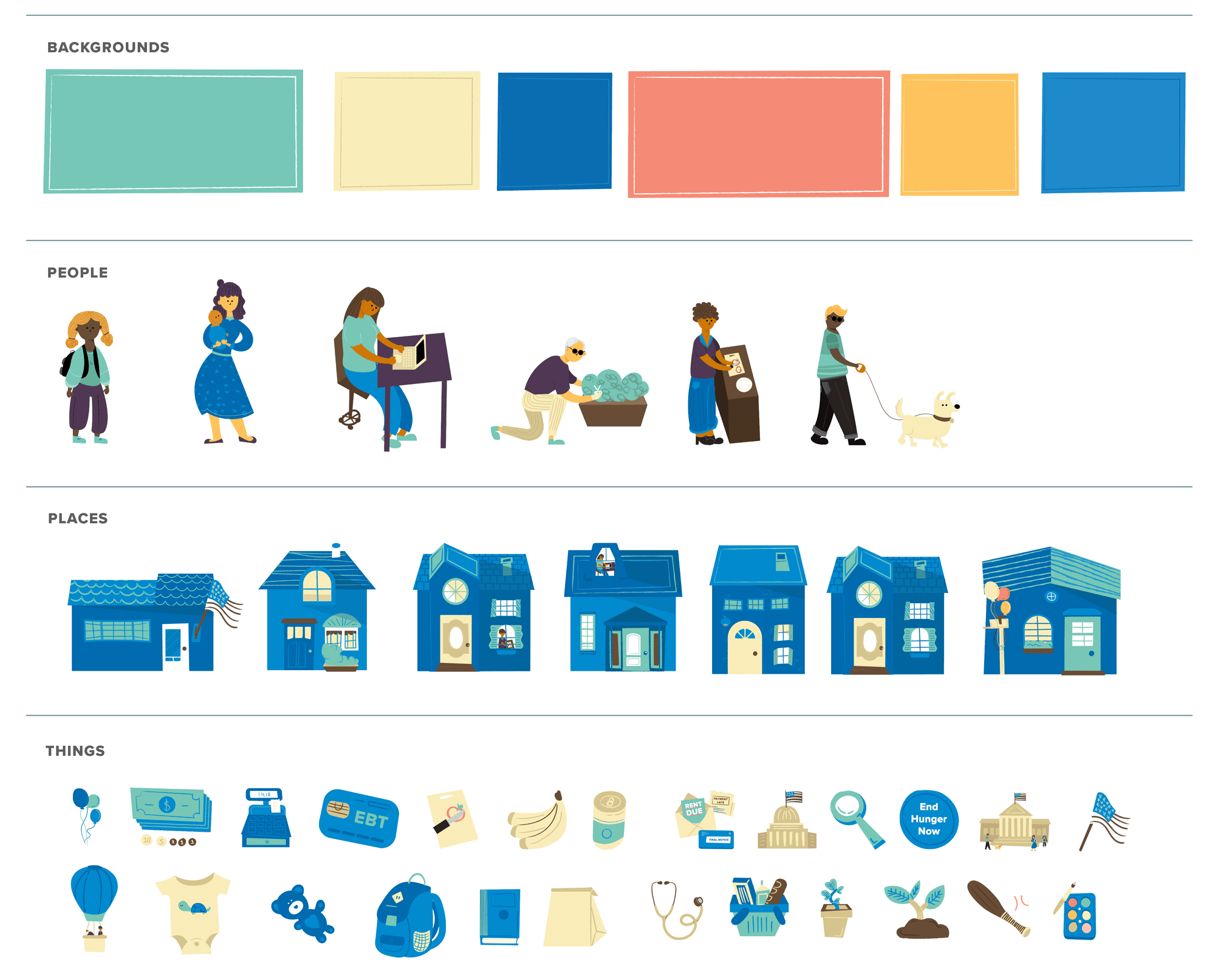
Illustration Toolkit
The illustration style also helps soften posts about delicate or tough topics.
Asset wise, illustrations allow us to create content that can be mixed and matched to suit a variety of messaging after the campaign ends.
The basic forms of the shapes are done with solid fills of one color. Details are added to the objects with pencil textured lines in order to create a more intimate feeling, as if an individual has hand drawn them. The shapes are uneven and imperfect to further communicate the human quality and personal nature of the messaging.
Organizing the toolkit
Since we had a short amount of time to produce illustrations, we strategically evaluated FRAC's past social media posts and created a list of the topics they share, the dates they post, and the length of information they are communicating. We then defined a multitude of different categories, and created as many graphic representations of those subjects as we could.
Childcare
Medical
Policy
Financial
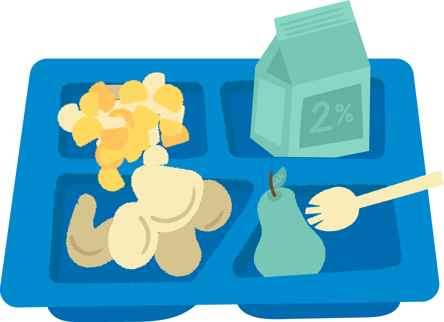
Food
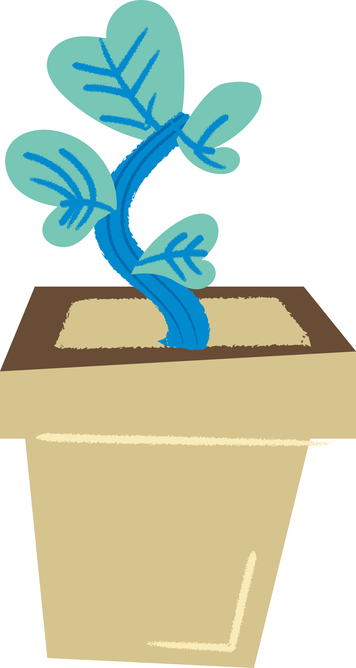
Growth
Hobbies
Holiday
Grade School
Higher Education
Technology
Veterans
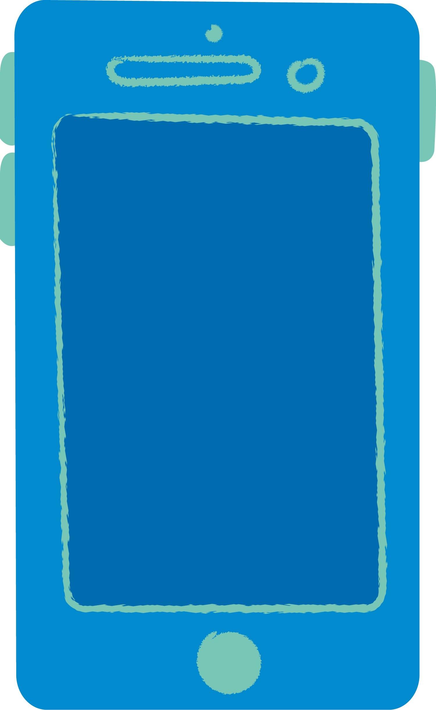
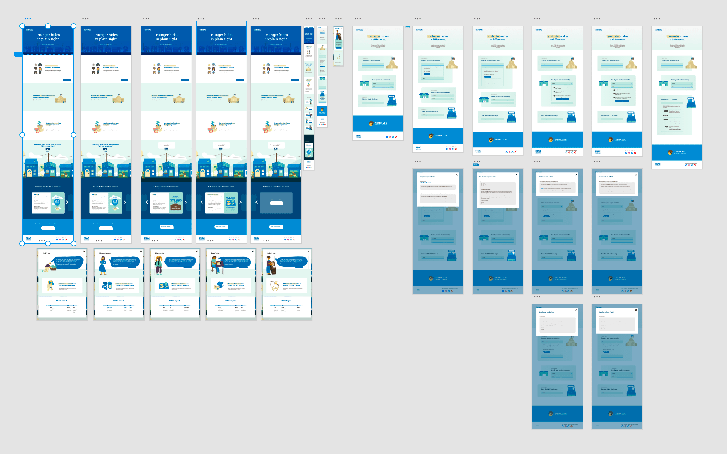
Campaign Landing Page
Benefits of Landing Page
Since FRAC has no buget for OOH advertising, a landing page was a product we could produce to finality without any need for time-consuming upkeep after publishing.
Using a longer form medium allows us to both share the reality of hunger in America while showcasing the solutions and FRAC's work to help end the issue.
The main FRAC website is intended for researchers; developing a landing page will open FRAC to a broader audience by allowing users to quickly understand what FRAC does.
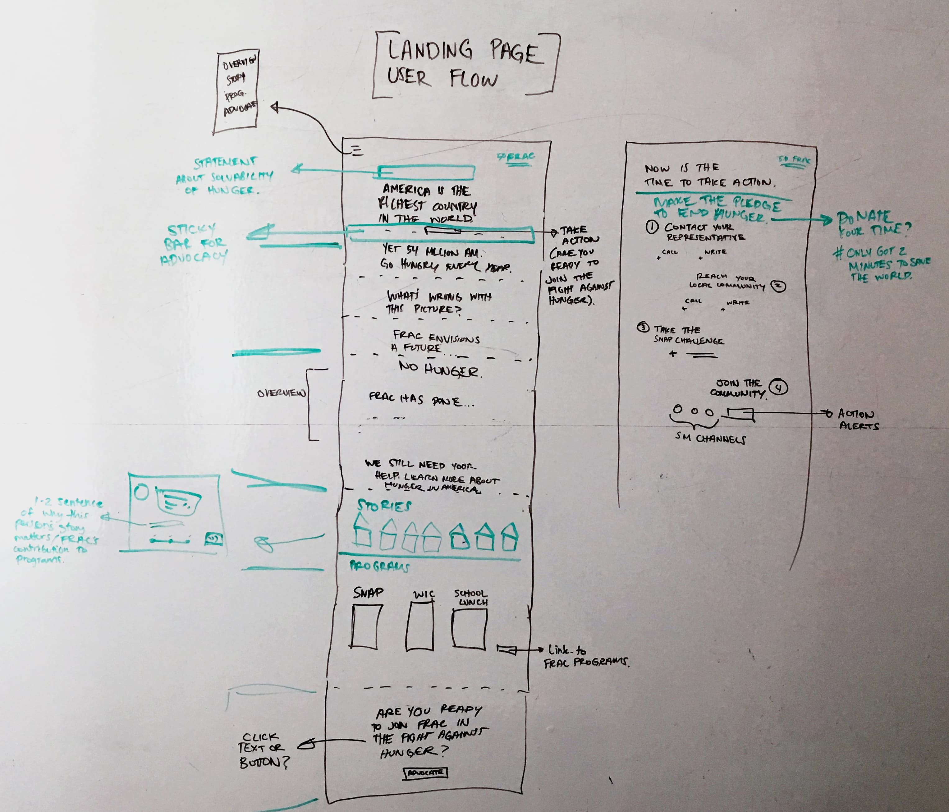
Development Process
Our team quickly worked through low fidelity to high fidelity prototypes, and then developed the site from scratch without any reliance on external libraries.
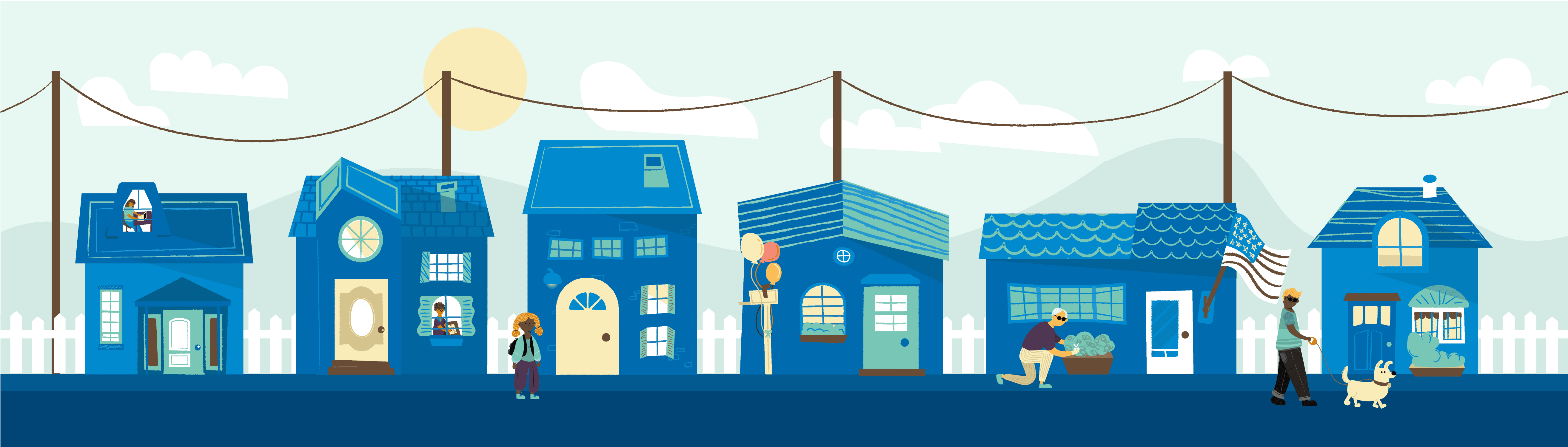
Interactive Street
The illustrative style for the stories allows people across demographics to empathize with Americans who are struggling with hunger. Showing a snapshot of a neighborhood street helps illustrate the closeness of the issue.
Each story highlights the intersectional issues of poverty-related hunger, while demonstrating the benefits of federal nutrition programs. Additionally, a timeline at the bottom of each story shows how FRAC’s efforts contributed to the programs in this person’s story.
We have chosen to include just enough of a story to get across the struggle and nutrition programs’ involvement, but we are including a link out to each of the full stories to avoid misrepresentation. Adding more text only increases the chance that our audience will click out of the window before reaching the programs and advocacy sections.
FRAC’s website is an impressive repository of information on poverty-related hunger. Though exhaustive with data and insights for the current audience to leverage, it doesn’t lend itself to quick learnings or action-seeking behavior. Both of these traits make it difficult to convert curious citizens into the active advocates we are seeking to advance our cause.
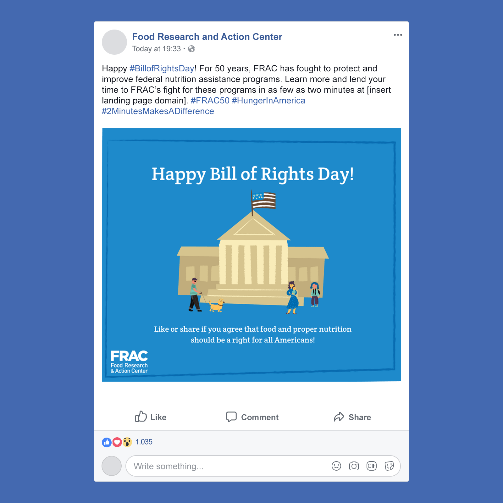
Outline for Impactful Graphics
1. Identify day/event to post about (full calendar provided in user guide).
2. Select an illustration from the asset library that pairs with the day/event subject.
3. Pick a background that complements the colors of the chosen illustration.
4. Try to keep your image header text below 40 characters.
5. Try to keep your image body text minimal while still communicating a clear message.
We created this post entirely in Canva Pro. We uploaded the fracblue_Facebook_background, FRAC all white logo, and supreme court image from the “Things” folder in the illustration library to Canva. The brand font, Crete Round, was downloaded from Google Fonts for free and then uploaded to Canva too.
Animated media ads
In order to further promote traffic to the campaign landing page, we developed a series of 3 animated media ads that can be promoted, espescially on Facebook.
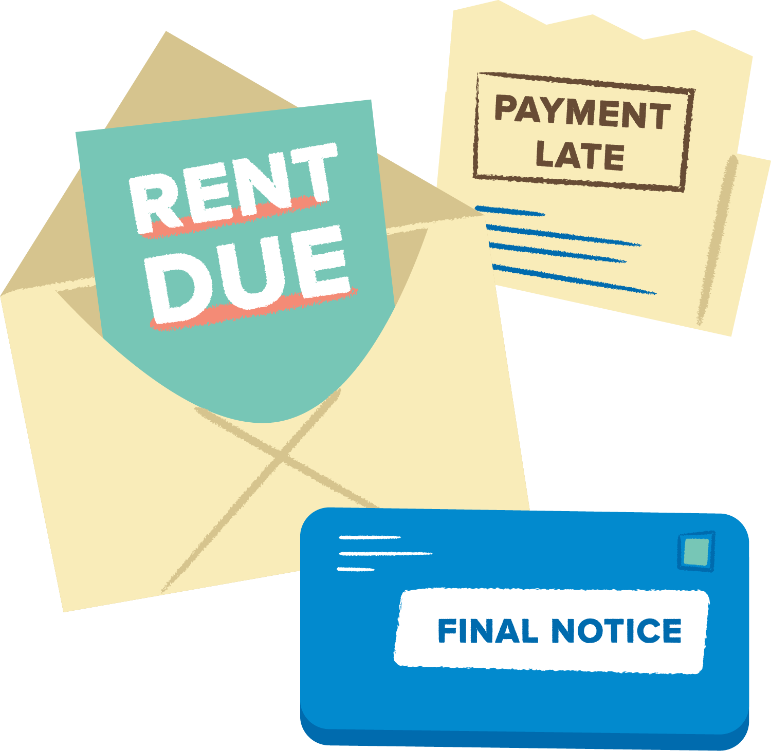
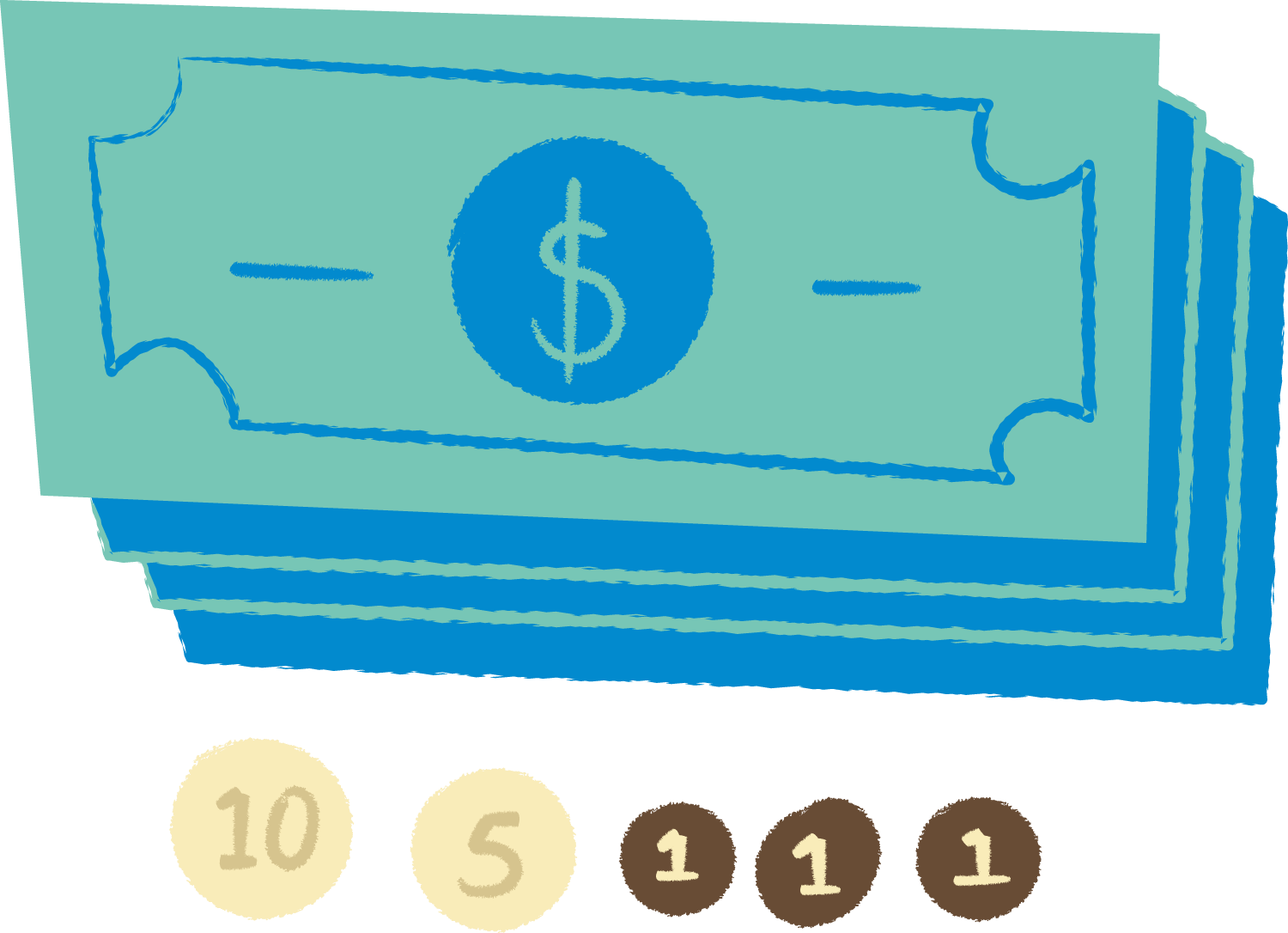
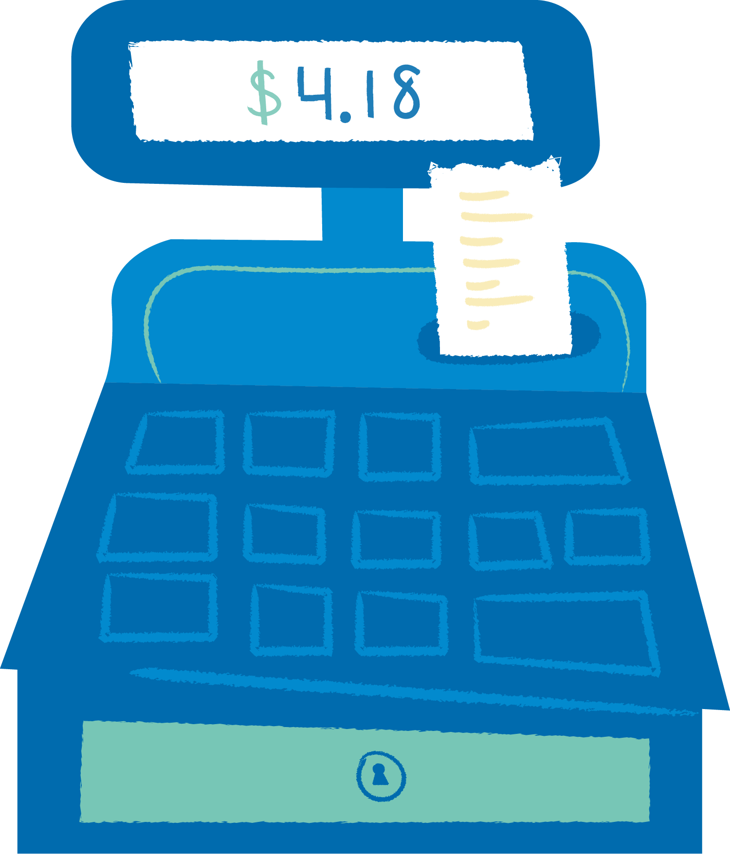
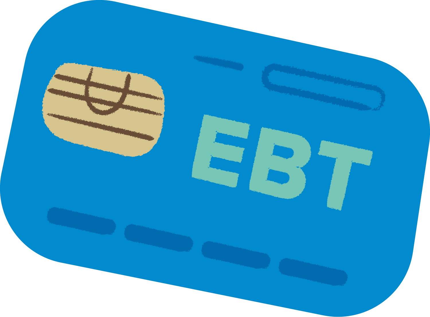
Each piece in the motion series plays off the idea of impossible choices to highlight why someone might choose to give up food in order to pay for something else necessary for survival. They are intended to spark curiosity into the mind of viewers in order to get them to click-through to the landing page that gives an overview of the issue and FRAC's efforts to end hunger.
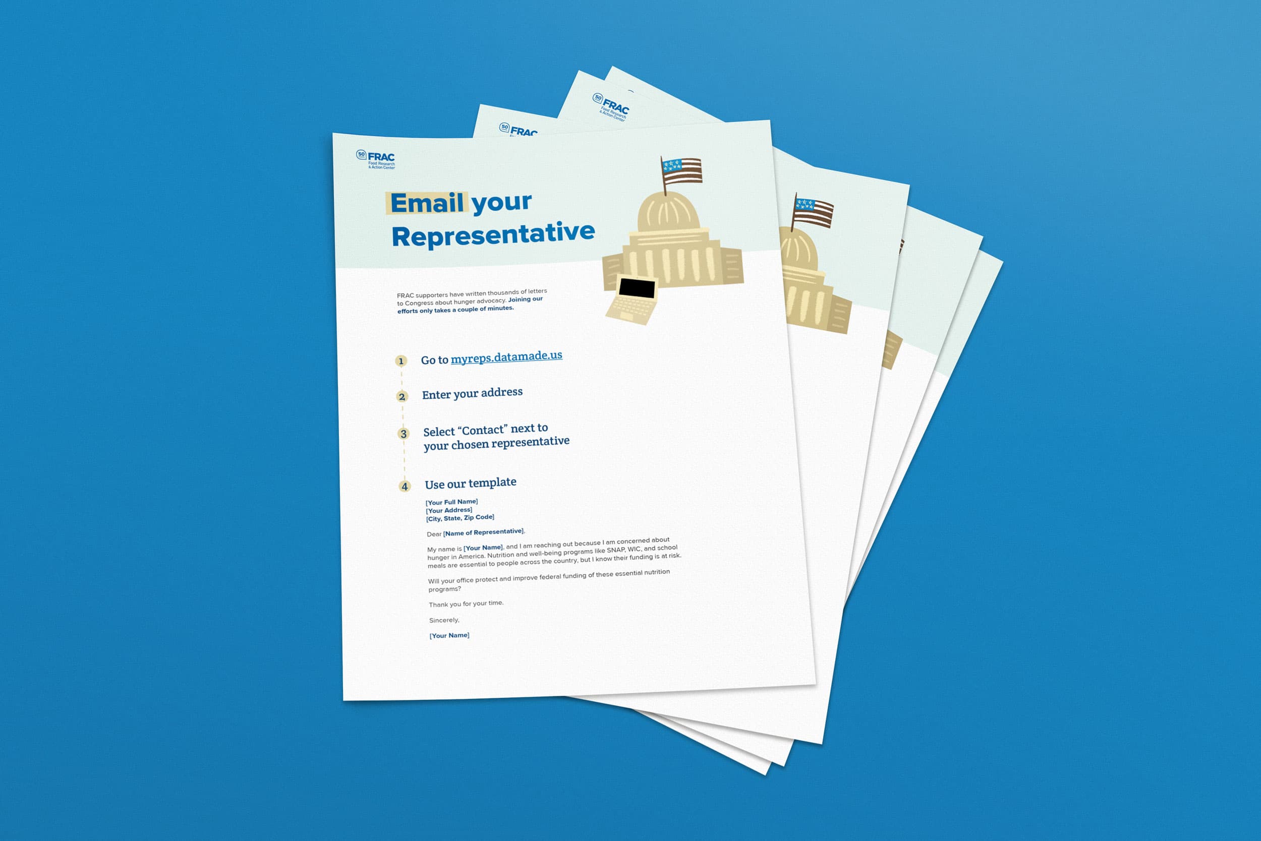
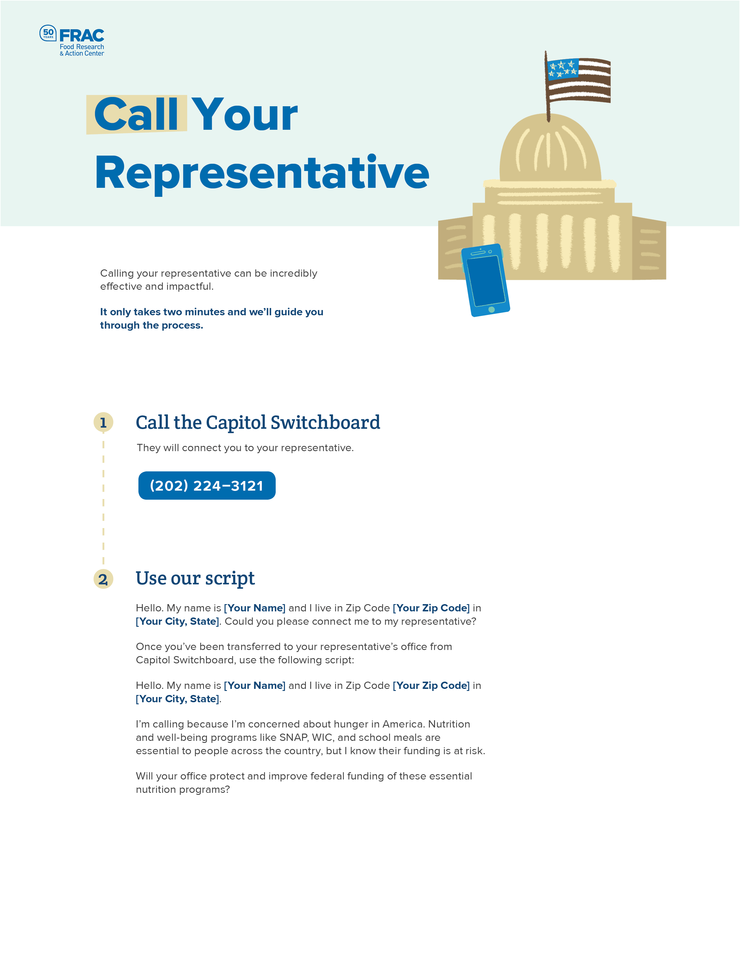
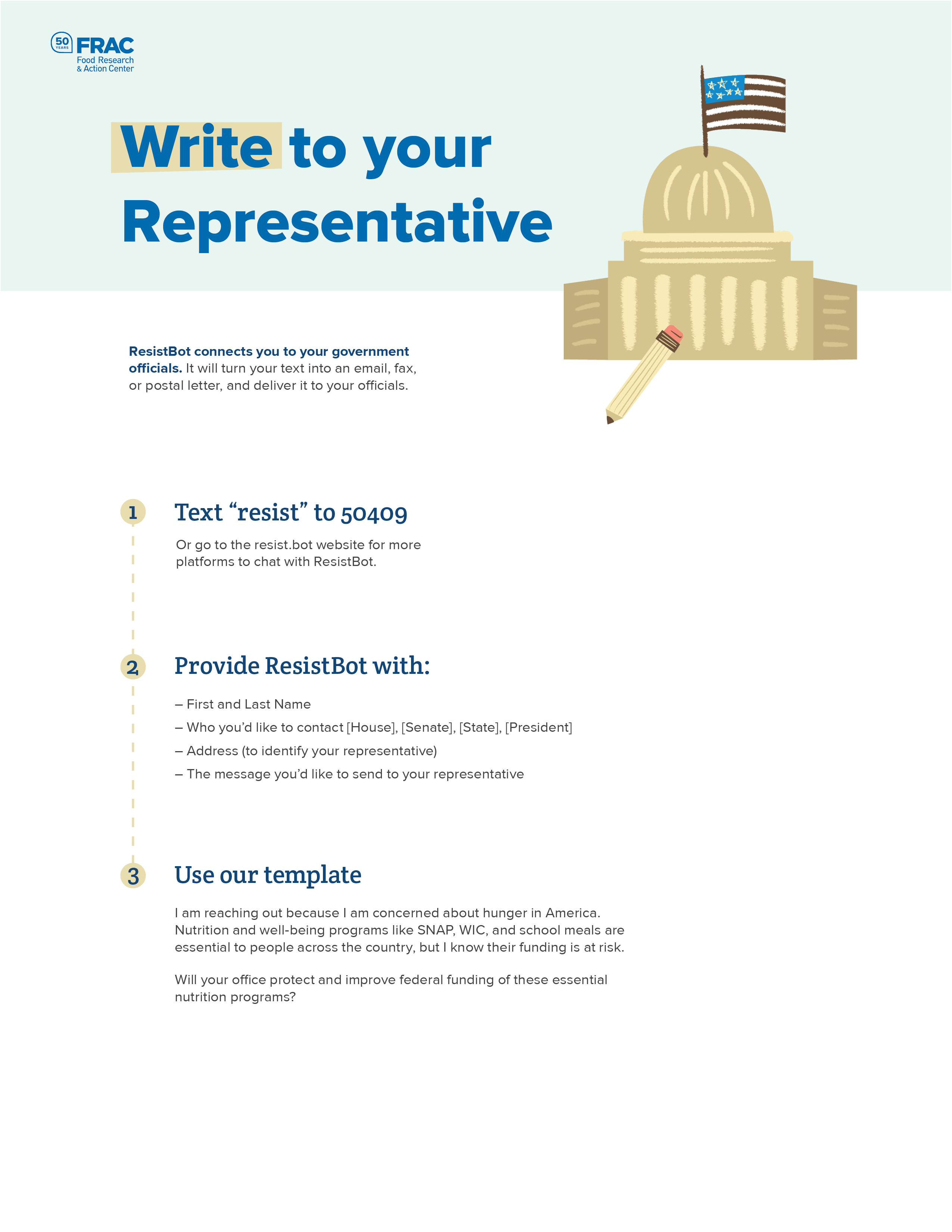
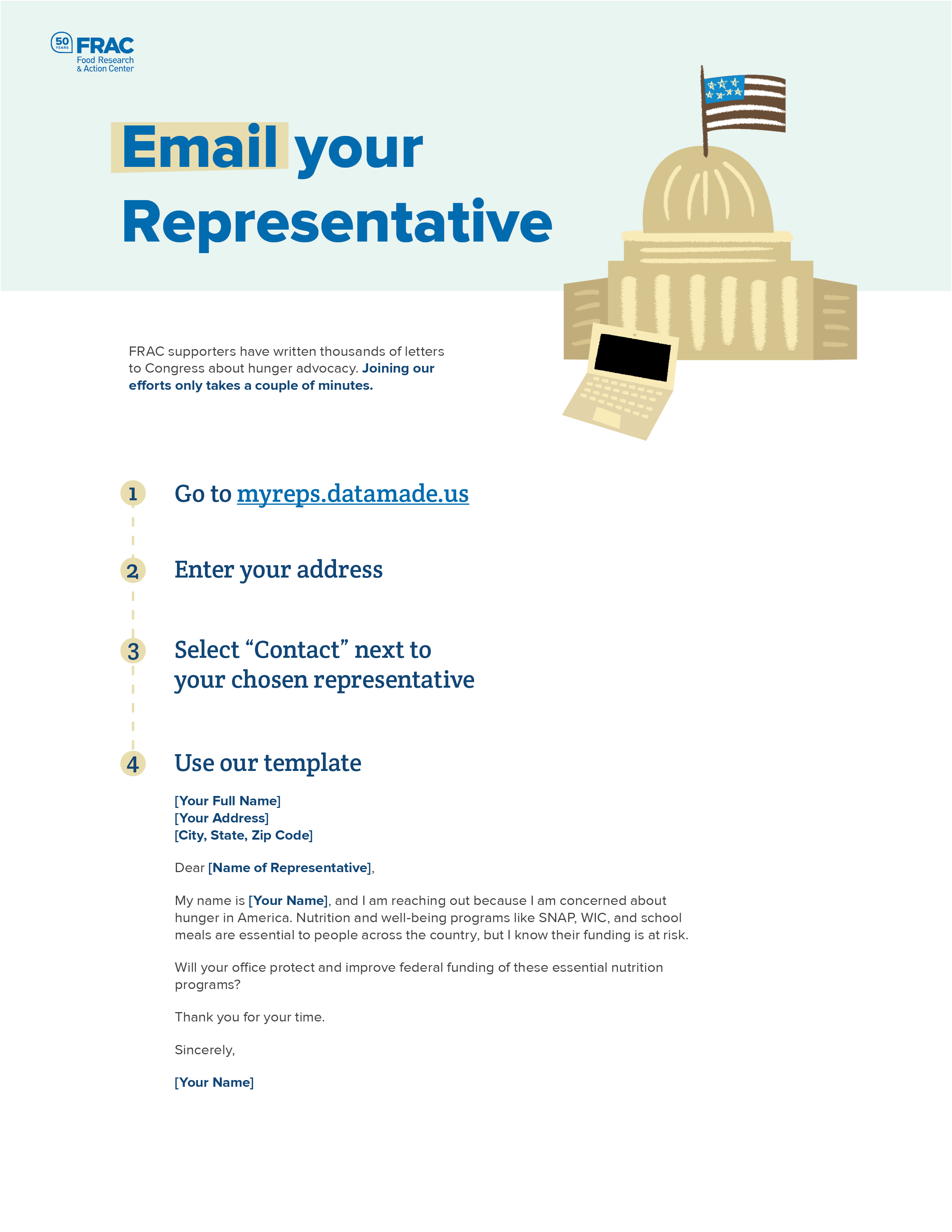
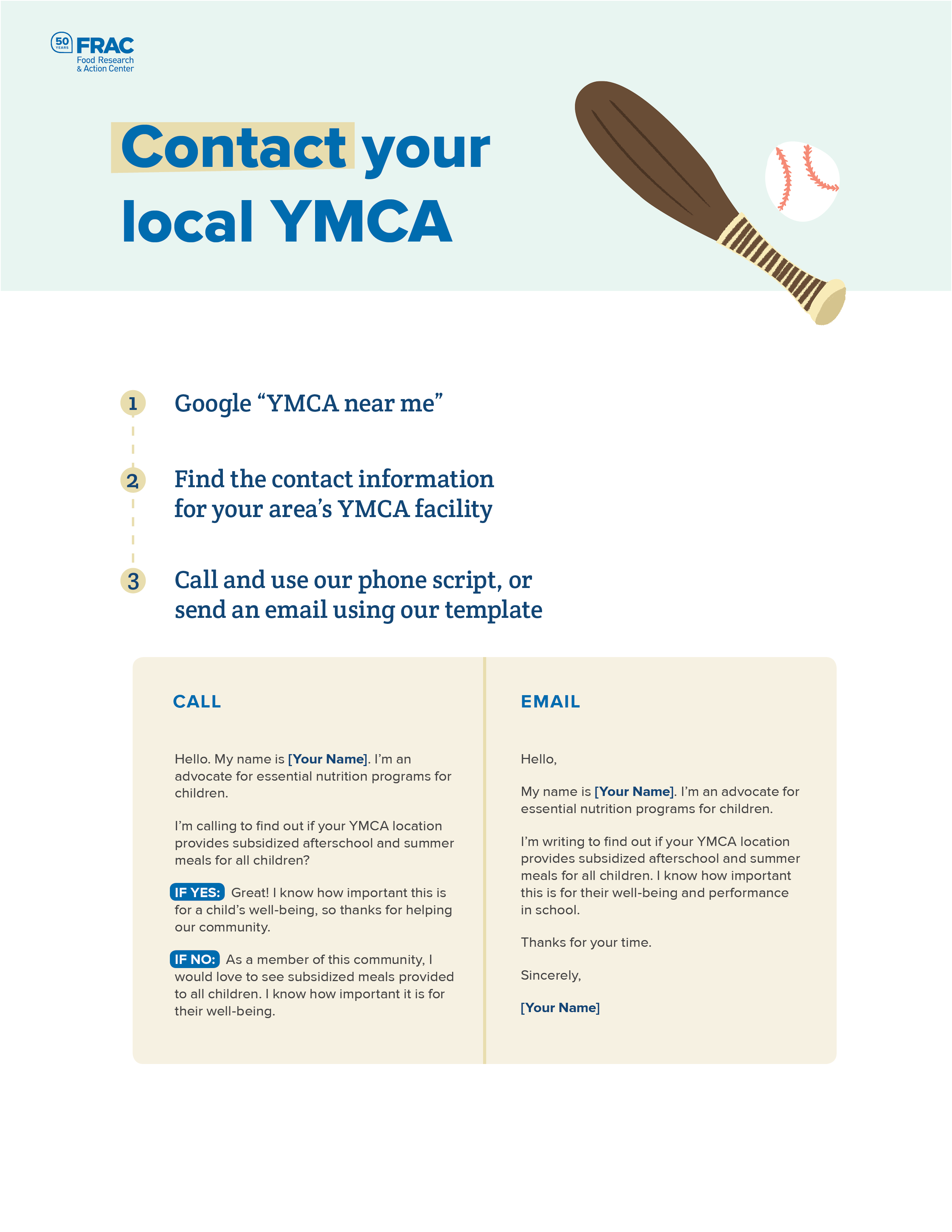
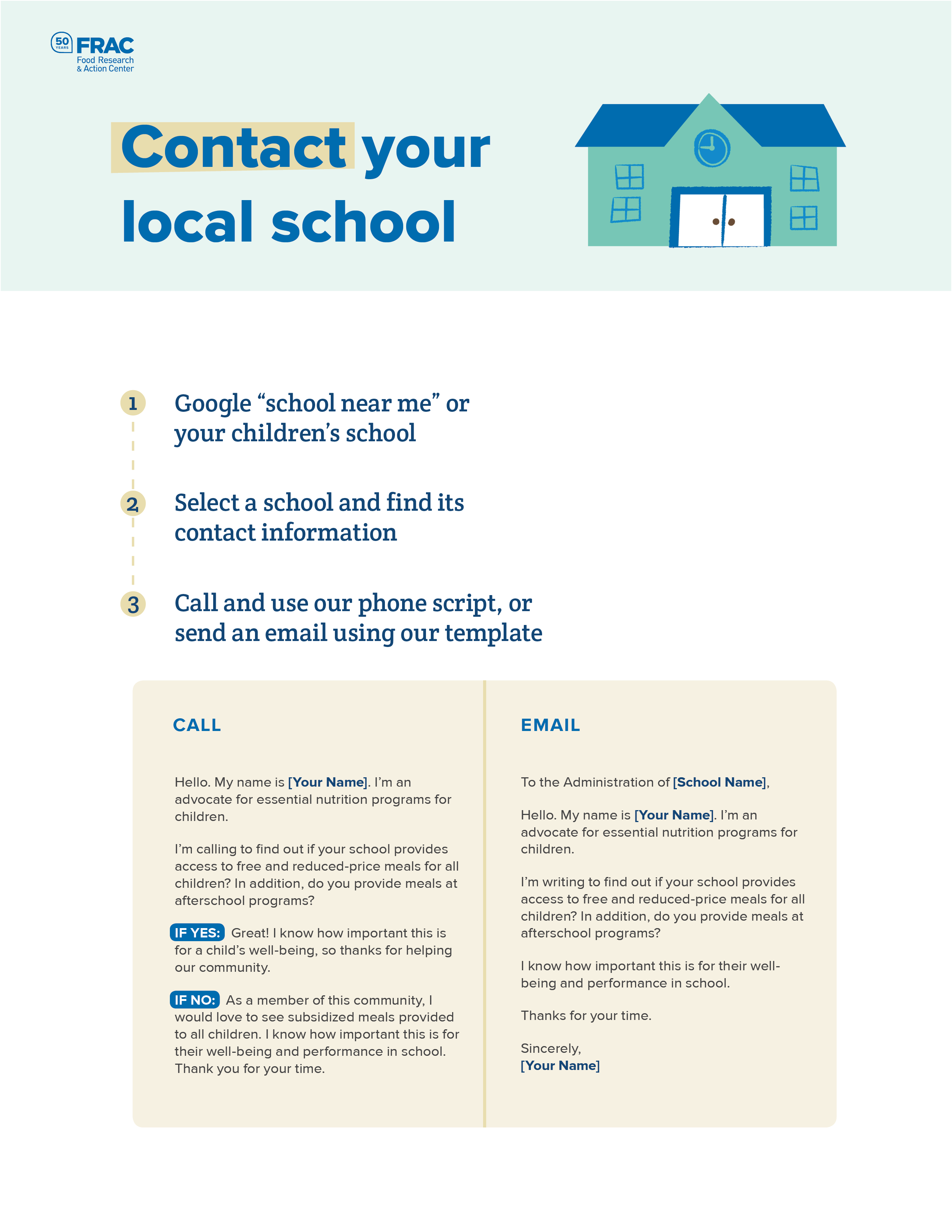
Shareable PDFs
PDF versions of our advocacy call-to-actions from the landing page were made for easy distribution by FRAC to their other advocacy groups and partners. These also allow easy and cheap printing for use at booths and other informational events.