The Brief
Migration
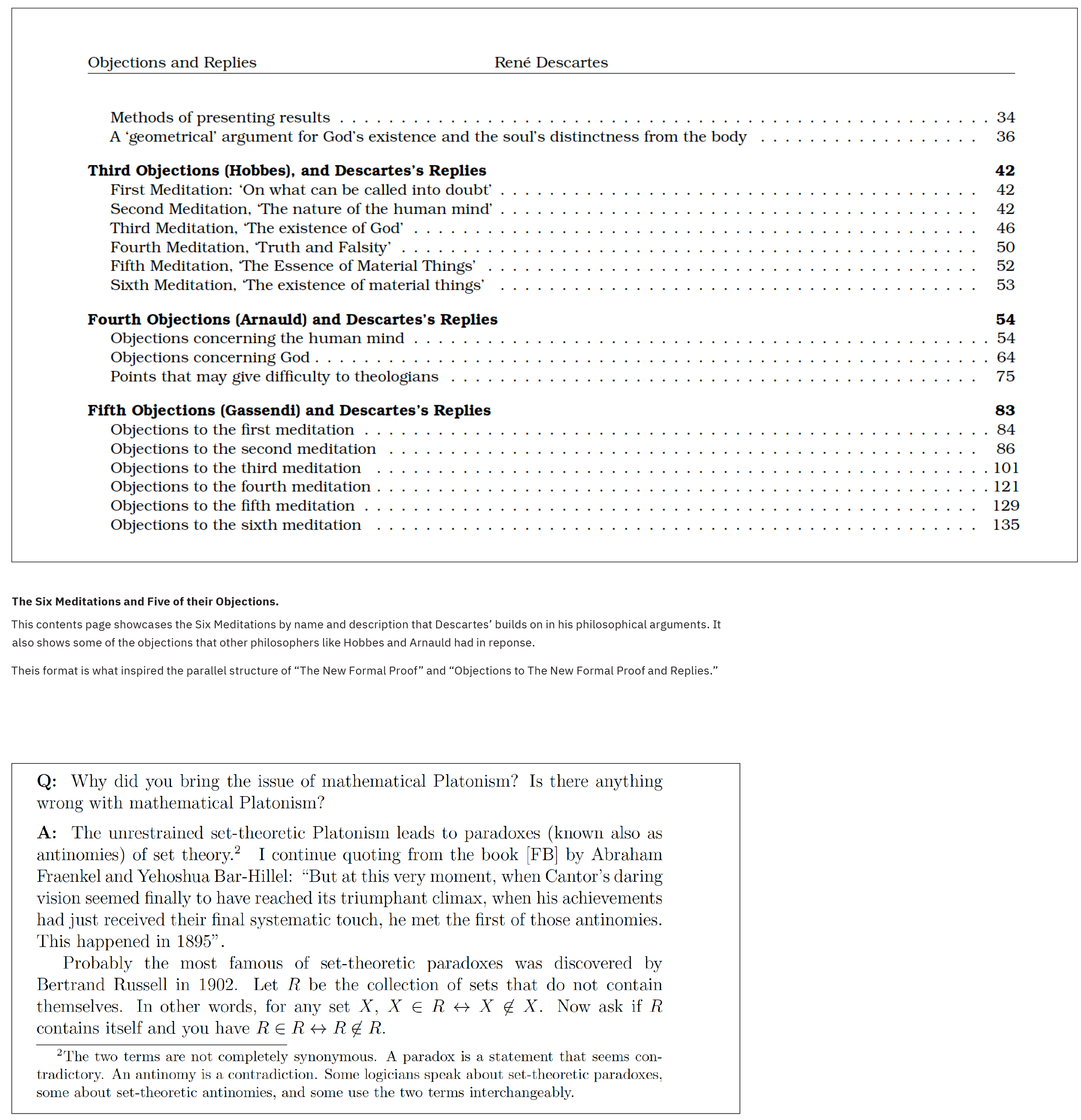
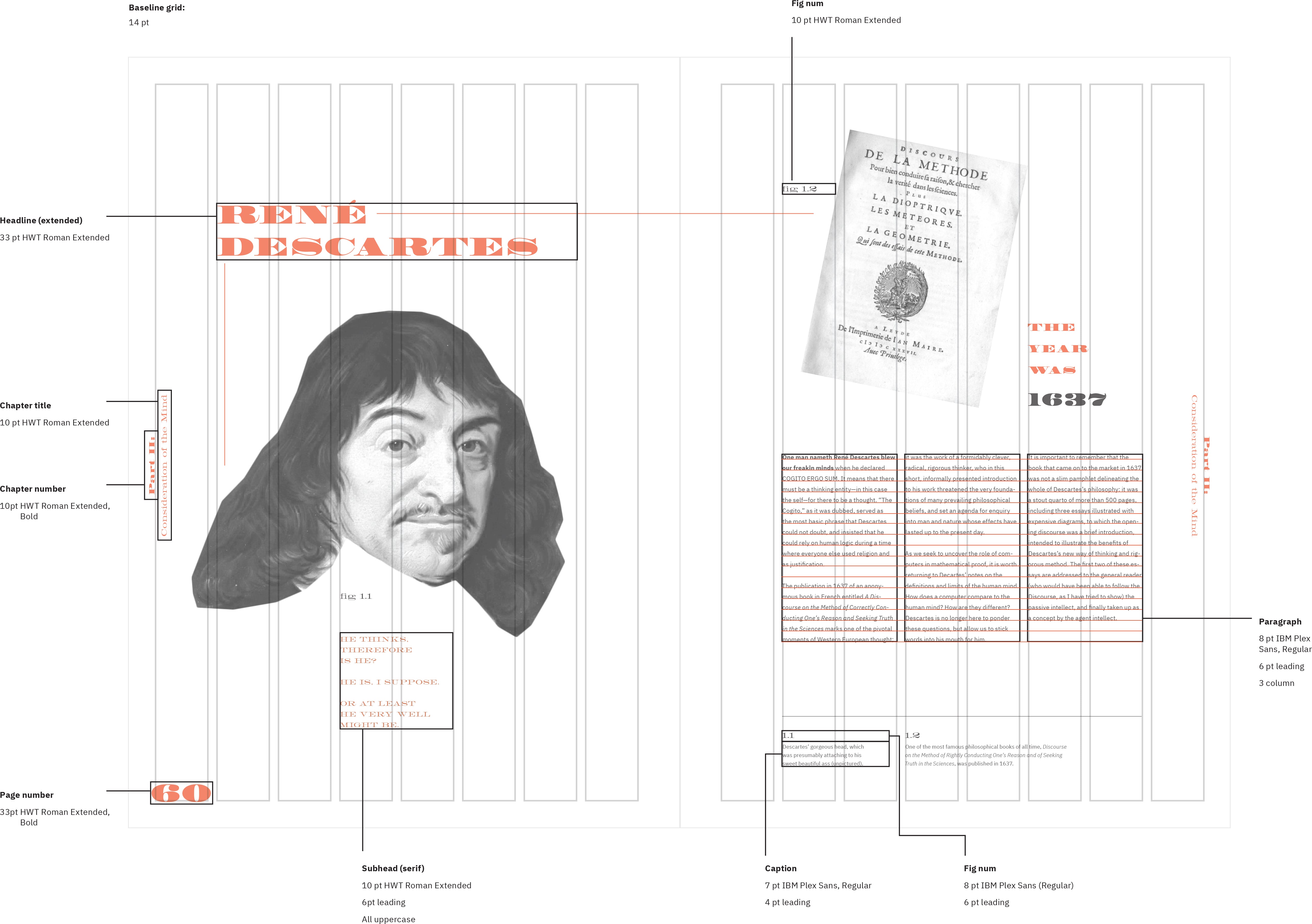
In their 2020 brief, the International Society of Typographic Designers asked practitioners to to design a typographic work celebrating the theme of ‘migration’ in any abstracted meaning of the word. I chose to focus on the migration of thinking in the mathematical community from the usage of the term "proof" to "formal proof" in order to account for the introduction of computers.
Communication Goals
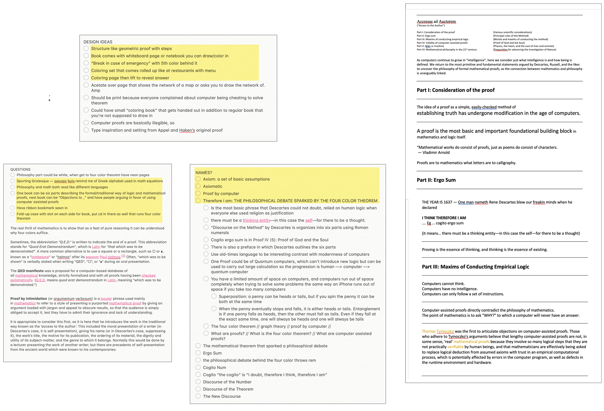
The content included in these books can be summed up into 6 main points, each of which is drawn from the 6 sections of “The New Formal Proof:”
- 1. A proof is the smallest building block of any anything we can accept to be true.
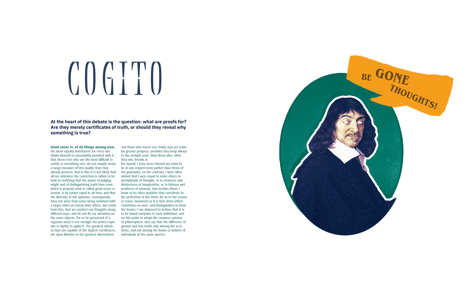
- 2. The essence of human logic is the ability to ask “why?”
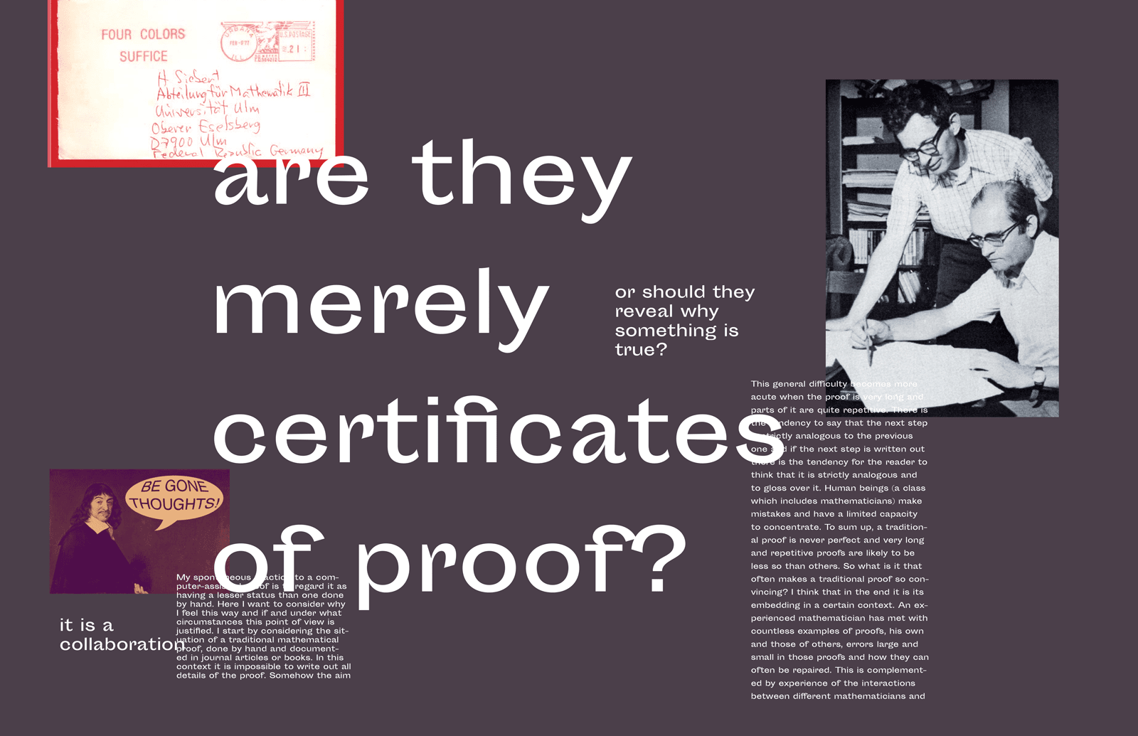
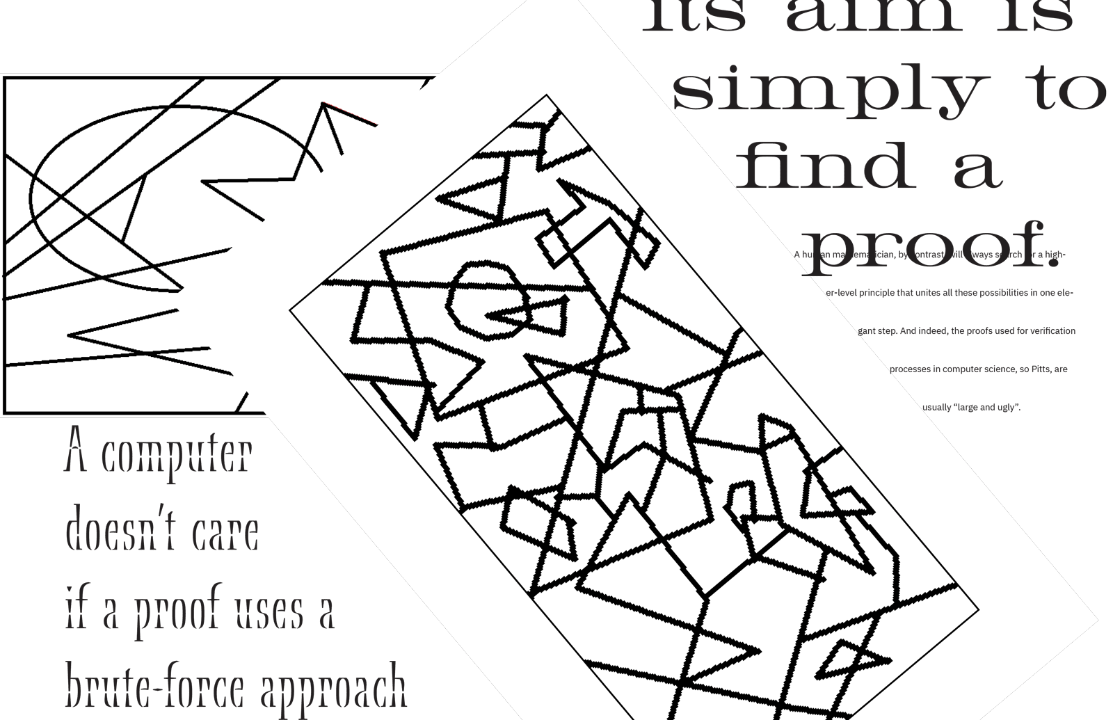
- 3. Computers can only follow a set of instructions, therefore cannot think.
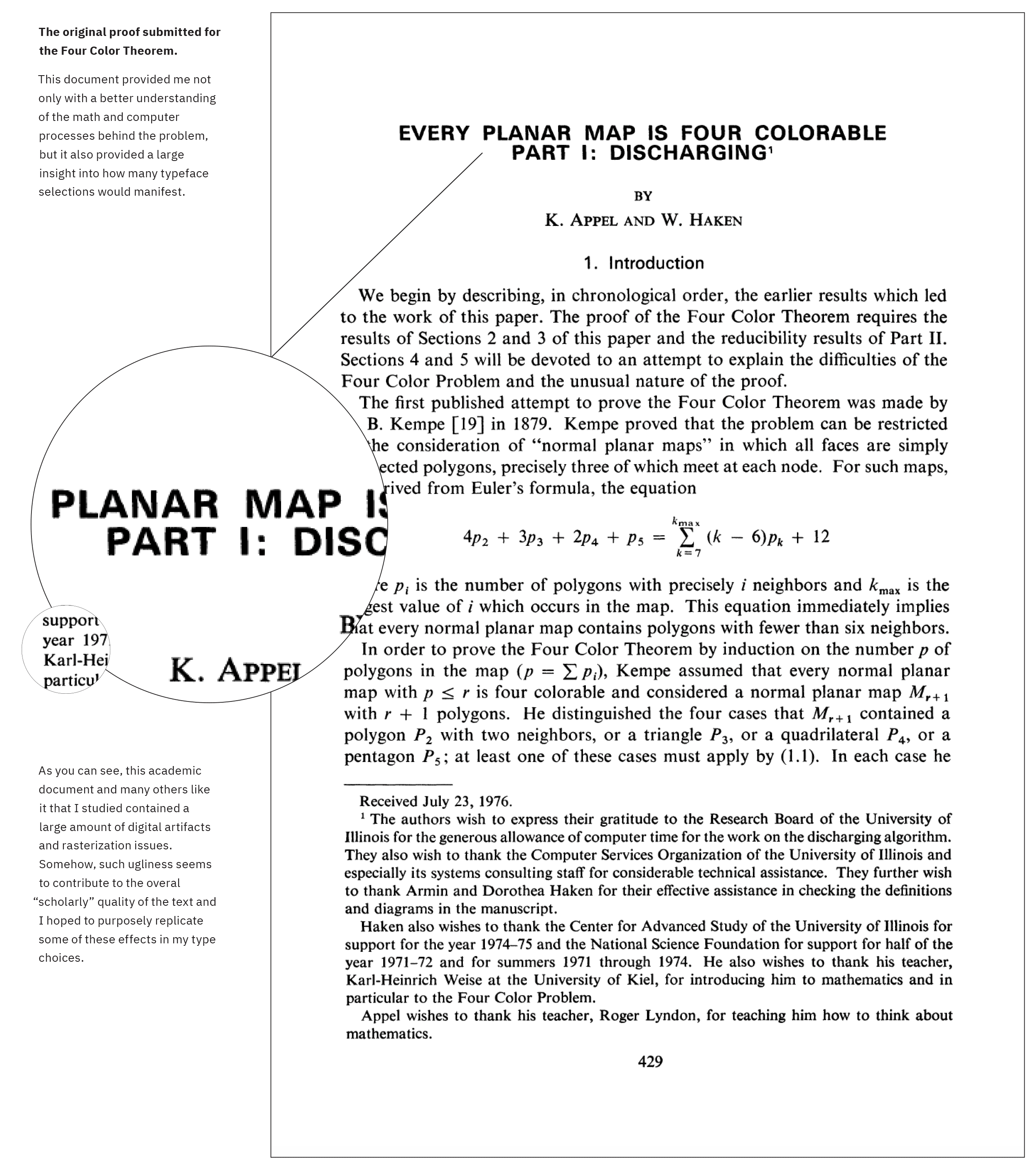
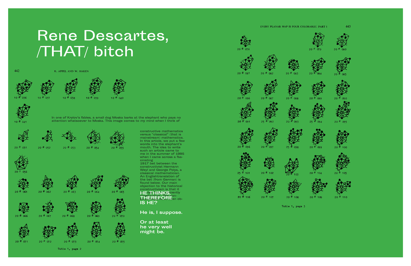
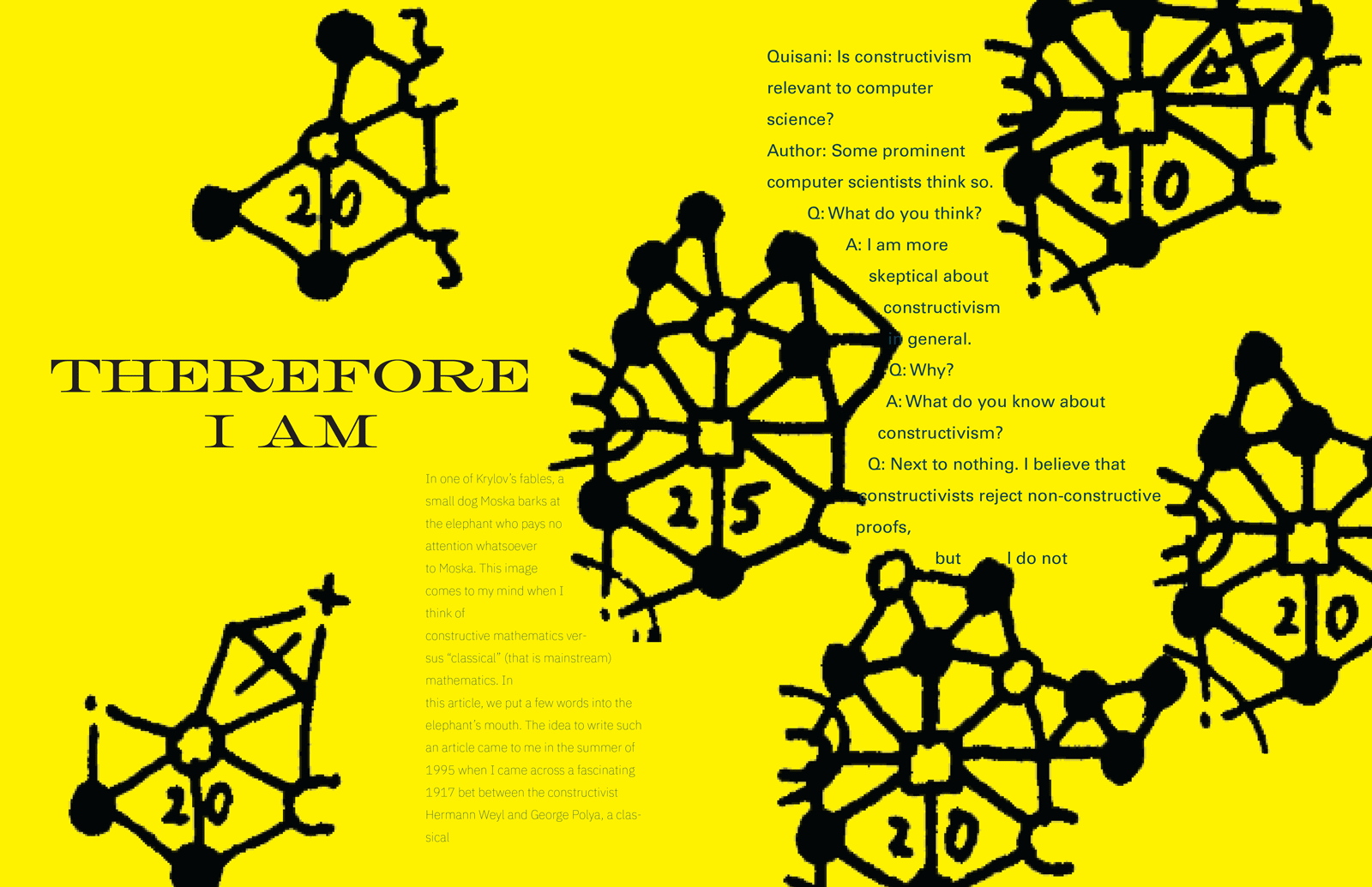
- 4. The Four Color Theorem was the first mathematical proof solved by a computer, which is why some consider this solution invalid.
- 5. Computers cannot replace human logic, but they do provide other advantages in combination with human logic.
- 6. The term “formal proof” is now being adapted among younger mathematicians to allow room for computers to assist in mathematics.