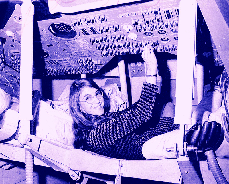
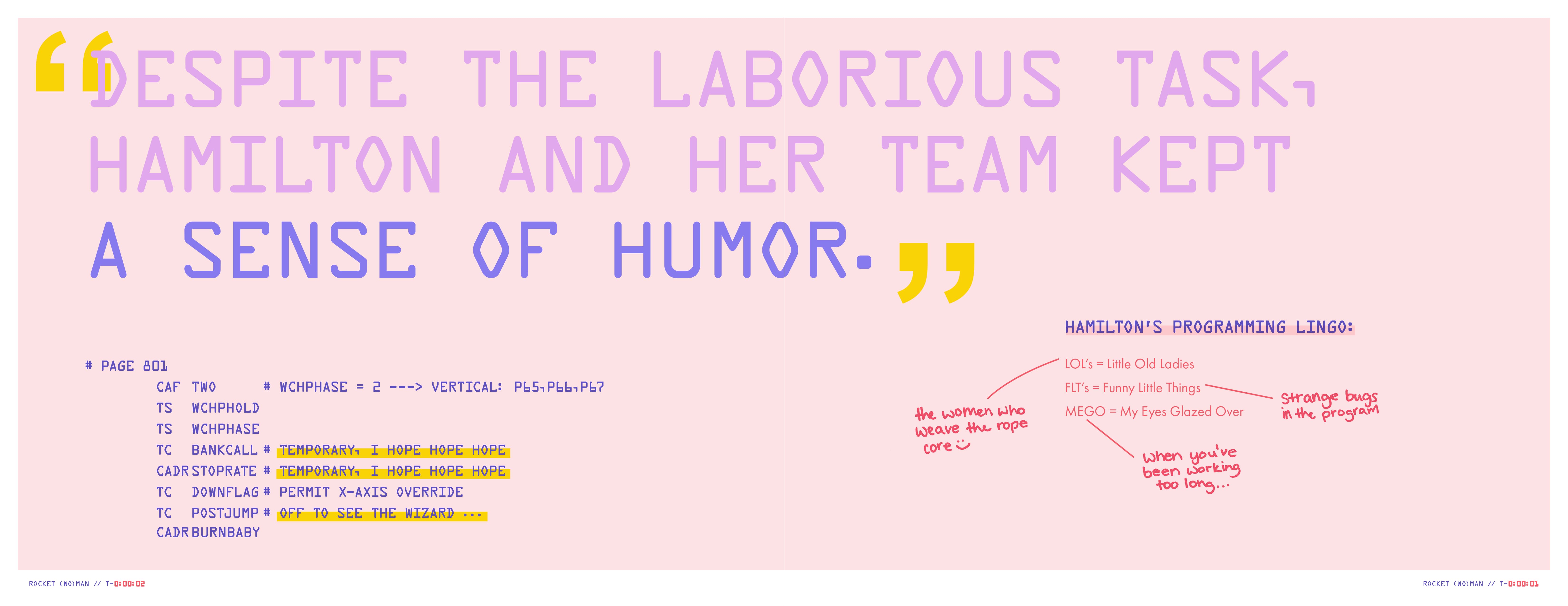
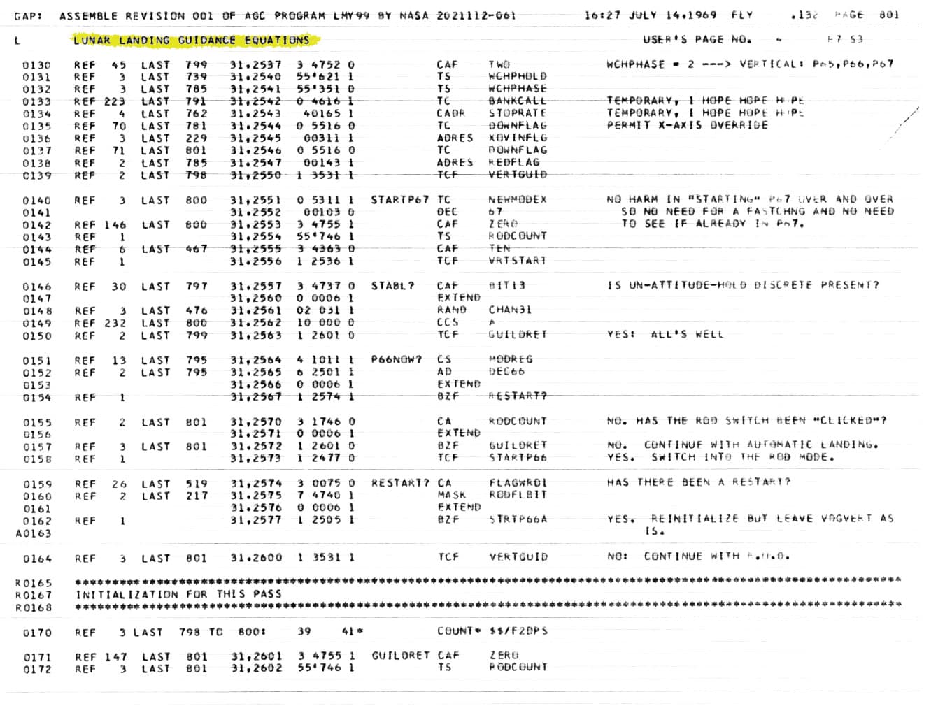
Hamilton often handwrote notes and jokes on NASA documents and within the code itself while working on the Apollo 11 launch.
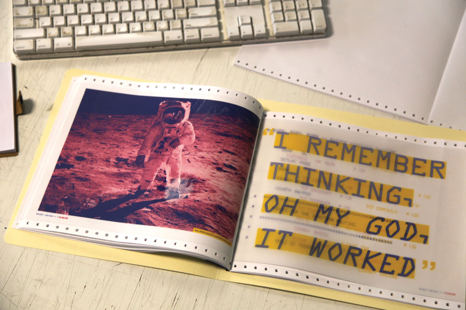
The final source code for Apollo 11 was printed on dot matrix paper.
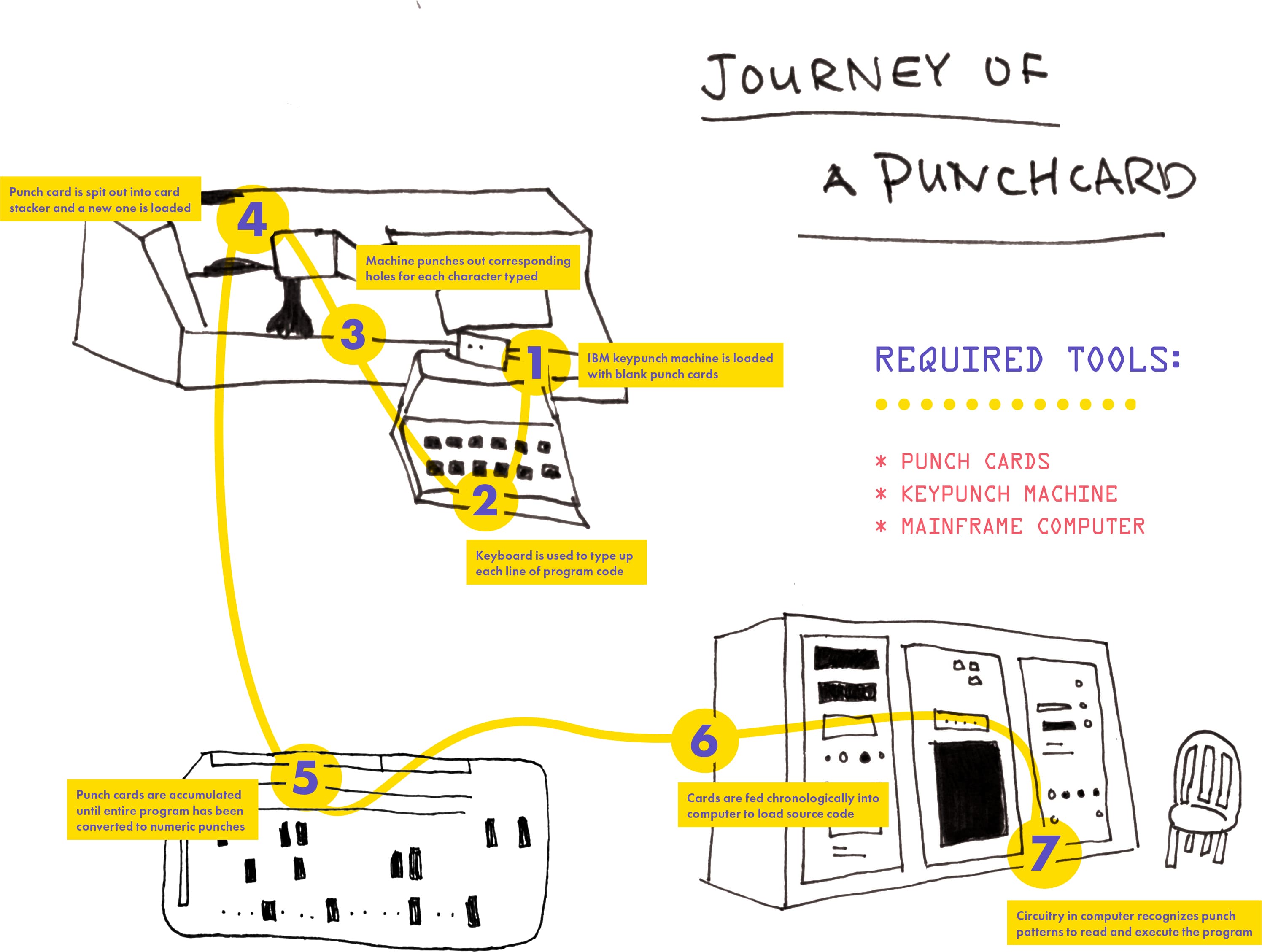
Code for the launch was loaded on computers by using punch cards, which were prepared by a group of women working at IBM keypunch machines.
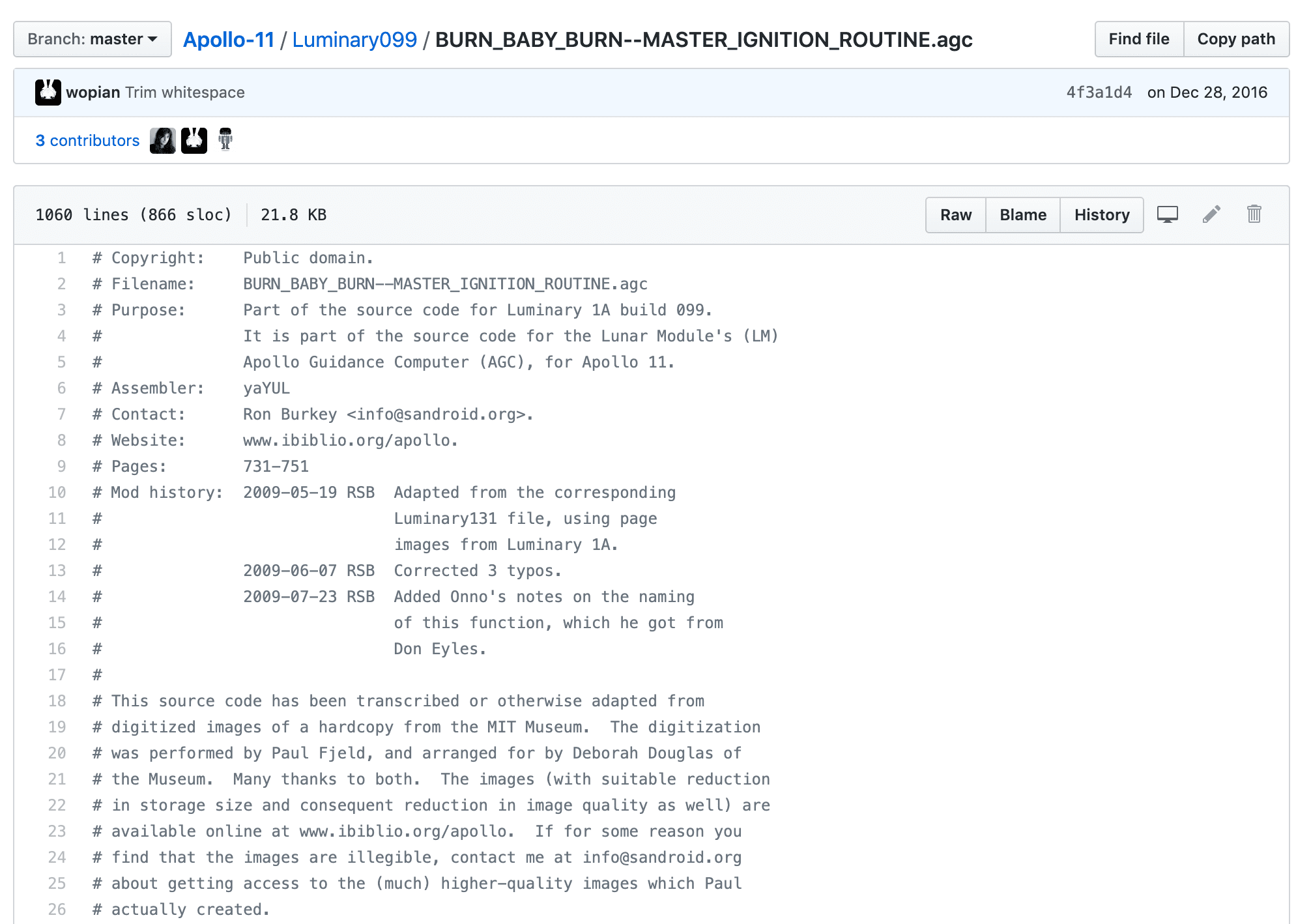
Launch code published on GitHub: Hamilton labelled the master ignition routine as BURN_BABY_BURN
Content Organization
Countdown to Launch
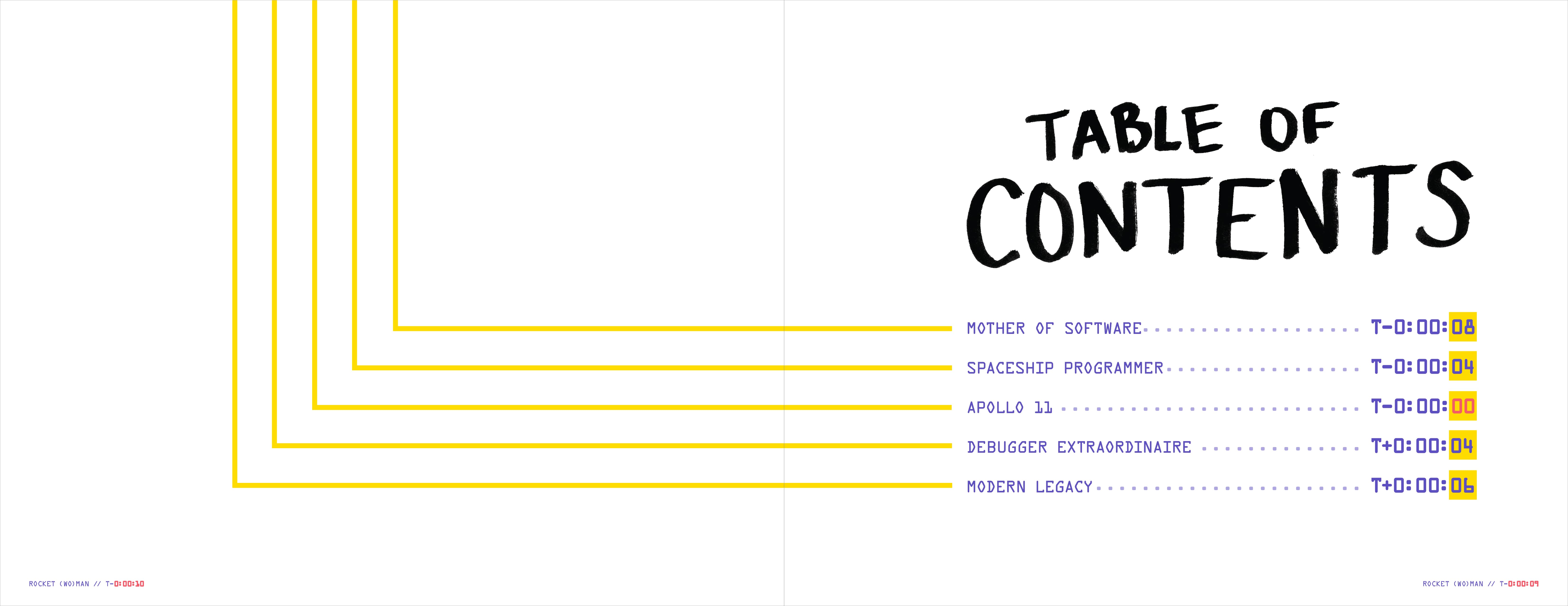
I chose to organize the structure of content chronologically, starting with Hamilton's introduction to software and then building up to the Apollo 11 launch. However, I also wanted to include information about her life after and outside of the Apollo 11 launch.
To allude to the events of the Apollo 11 launch that Hamilton is most famous for, I decided not to order the pages in the typical fashion (starting with 1 and counting forward). Instead, I used countdown time – the page that describes the actual launch was labelled as T-0:00:00 rather than Page 1. All pages that come before the Apollo 11 launch count backwards in liftoff time, and all pages after the Apollo 11 launch count forwards in liftoff time.
Artifact Integration
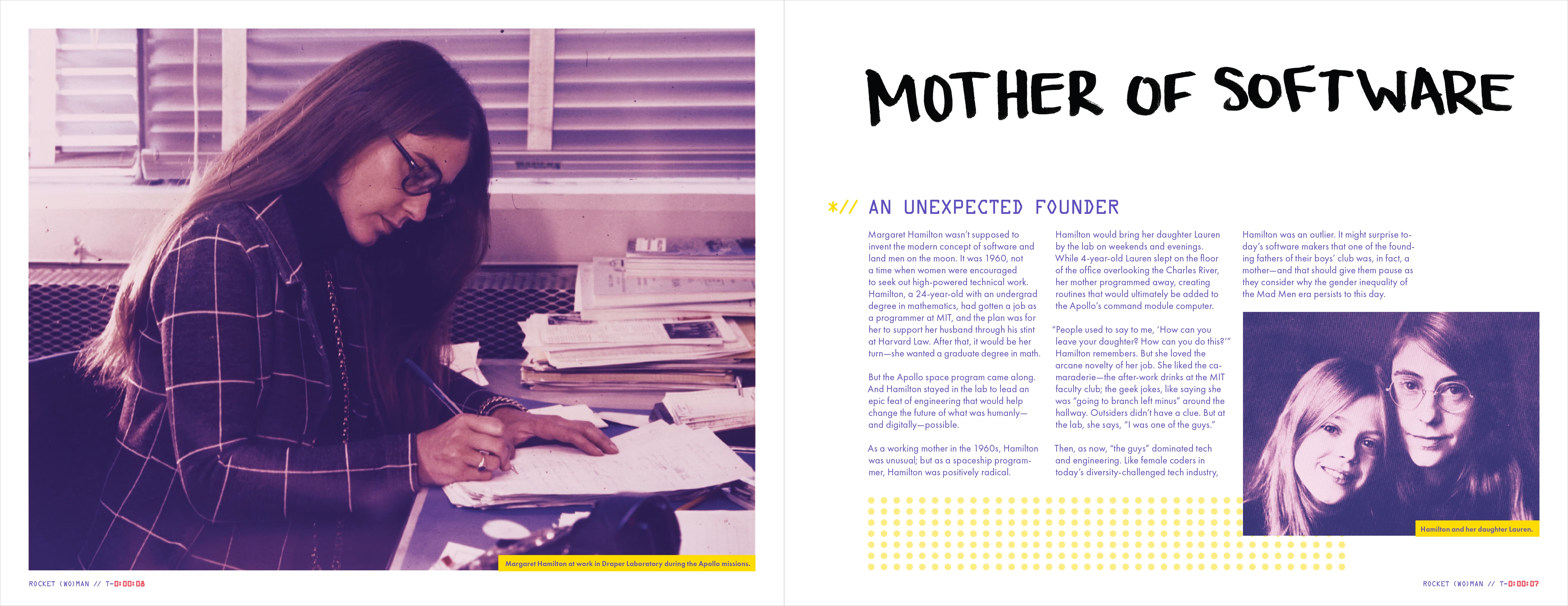
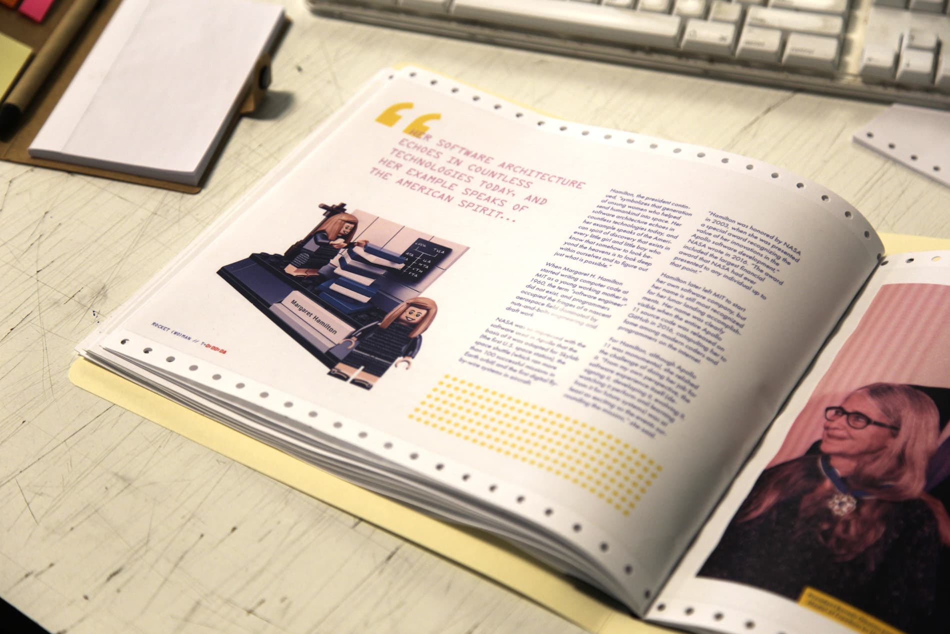
A mix of photography and handwritten/handdrawn elements were used for the visuals of the book. A duotone effect was used on photos of Hamilton that I found. Since almost all of them were in black and white originally, this allowed me to introduce an element of color that was unique to my book while keeping the historic feel of the original photographs. In addition, the hand-done elements were created from scratch and superimposed over the photos in reference to the humorous and playful notes that frequented Hamilton's work.
Punch Card Diagram
During Hamilton's time, programming code wasn't just typed straight into text editors like it is today – instead, it was literally punched into a series of cards with a grid of numbers on them, and then these cards were fed into the computer. I spent several hours watching videos and reading articles to fully understand how punch card programming worked, and then simplified what I learned into a visual diagram to be included in the book.
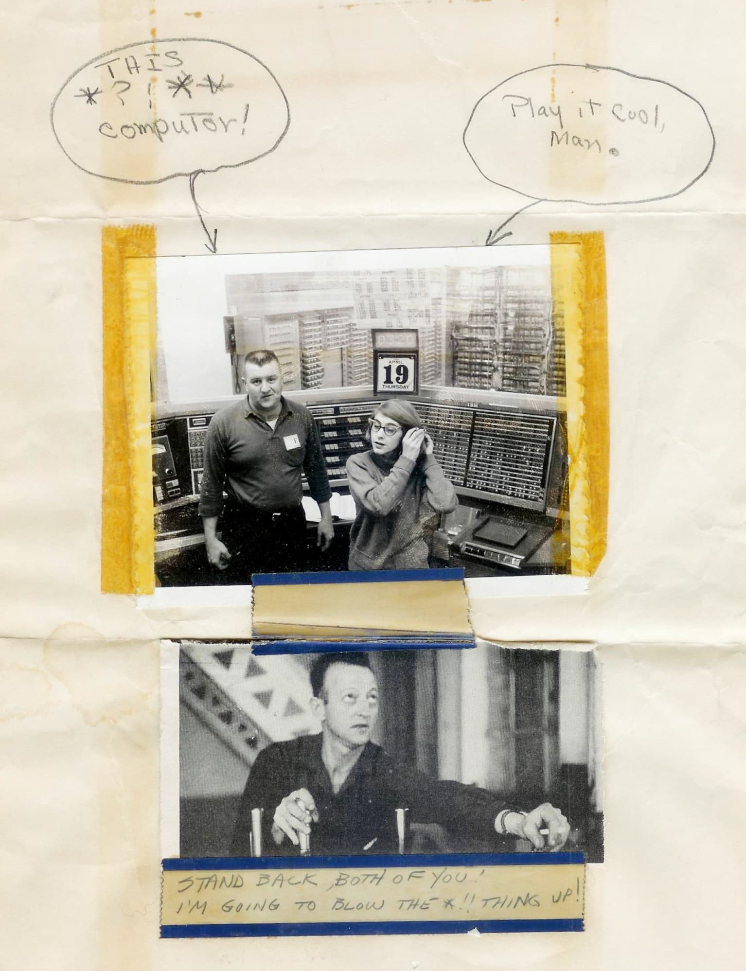
Highlighting Source Code Humor
By looking through the Apollo 11 launch code on GitHub, a slew of Easter Eggs written by Hamilton and the programming team can be found. Quotes from William Shakespeare's Henry V, popular video game references, and other informal banter pop-up suprisingly often. I chose to include a few of these humorous moments and highlight them within the editorial design.
Typography
The headline type for this project was handwritten, giving a visual contrast to the mechanical typefaces used for the body text. It also alludes to the notes and personality of Hamilton herself.
Subheads were set in OCRA, a monospace font that was developed in the early days of computer usage and was used in programming contexts.
Body type was set in Futura, widely considered the "unofficial" typeface of NASA. It is also the first typeface on the moon, as it was used on the plaque on the lunar landing vehicle.
Printing & Binding
Dot Matrix Printing
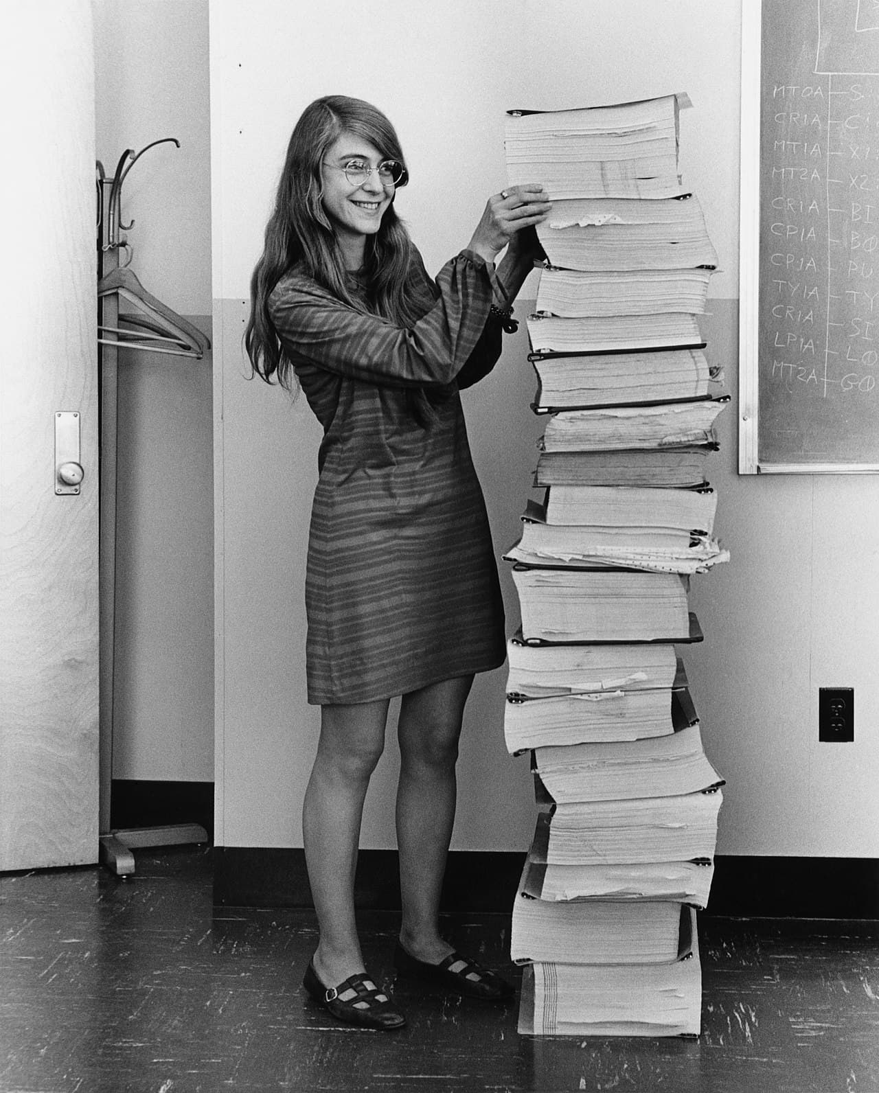
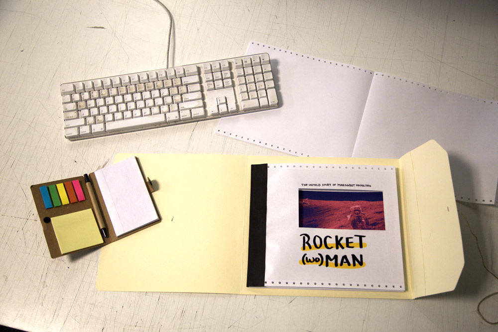
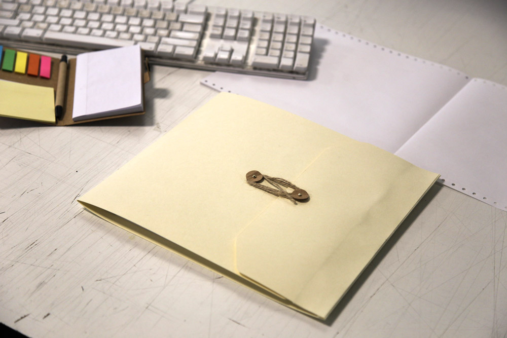
The most well-known photo of Hamilton is of her standing next to the paper stack of fully printed Apollo 11 source code – printed, of course, on dot matrix paper. In accordance with Hamilton's work, I wanted to print my booklet about her on dot matrix paper as well. But dot matrix printers are hard to find, and professional printing places wouldn't let me run thin dot matrix paper through their machines. So, with a little bit of improvising, the spreads were printed backwards onto T-shirt transfer papers. These were then heat pressed onto to the dot matrix paper and French folded, then glued to be a perfect bind. Finally, the booklet was encased with heavy manilla cardstock in order to give it that authentic NASA-file feel.
The usage of heat press on a dot matrix paper added a unique textile quality and a worn, slightly uneven texture that is contextually reminiscent of the actual documents that survive the Apollo 11 launch today.