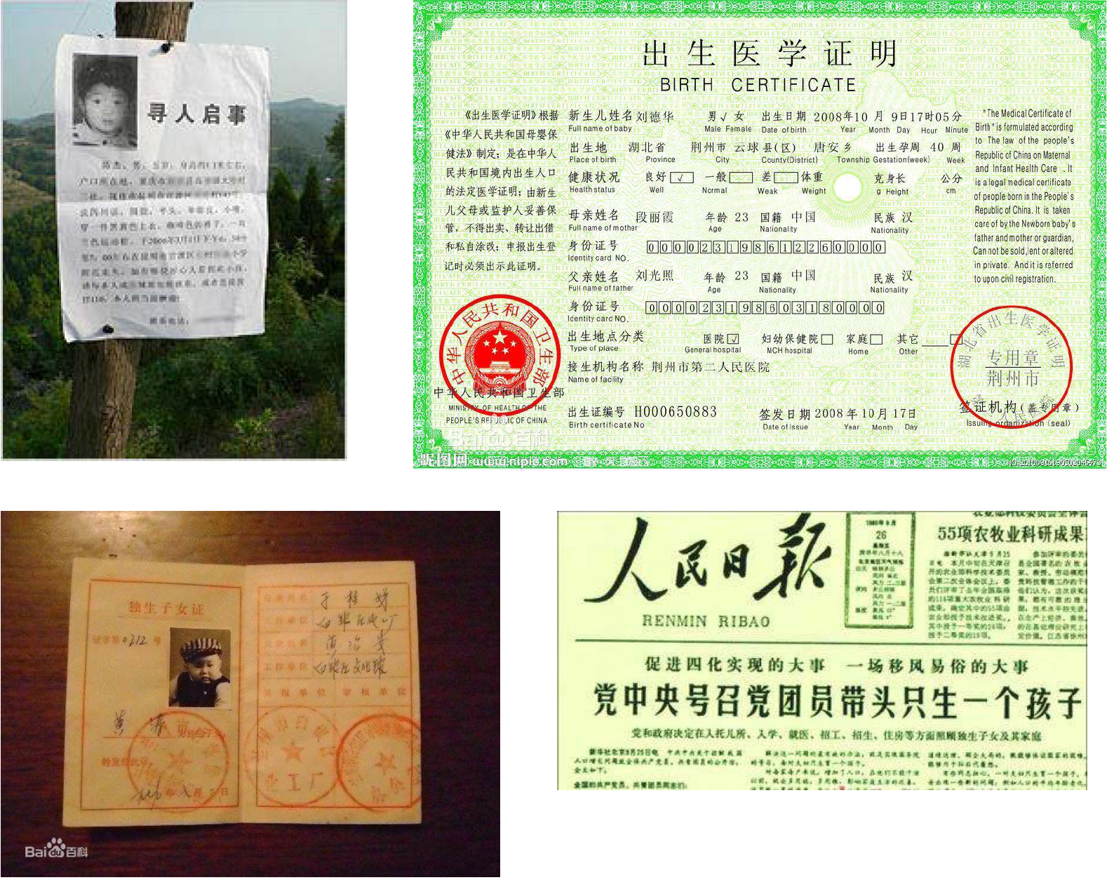
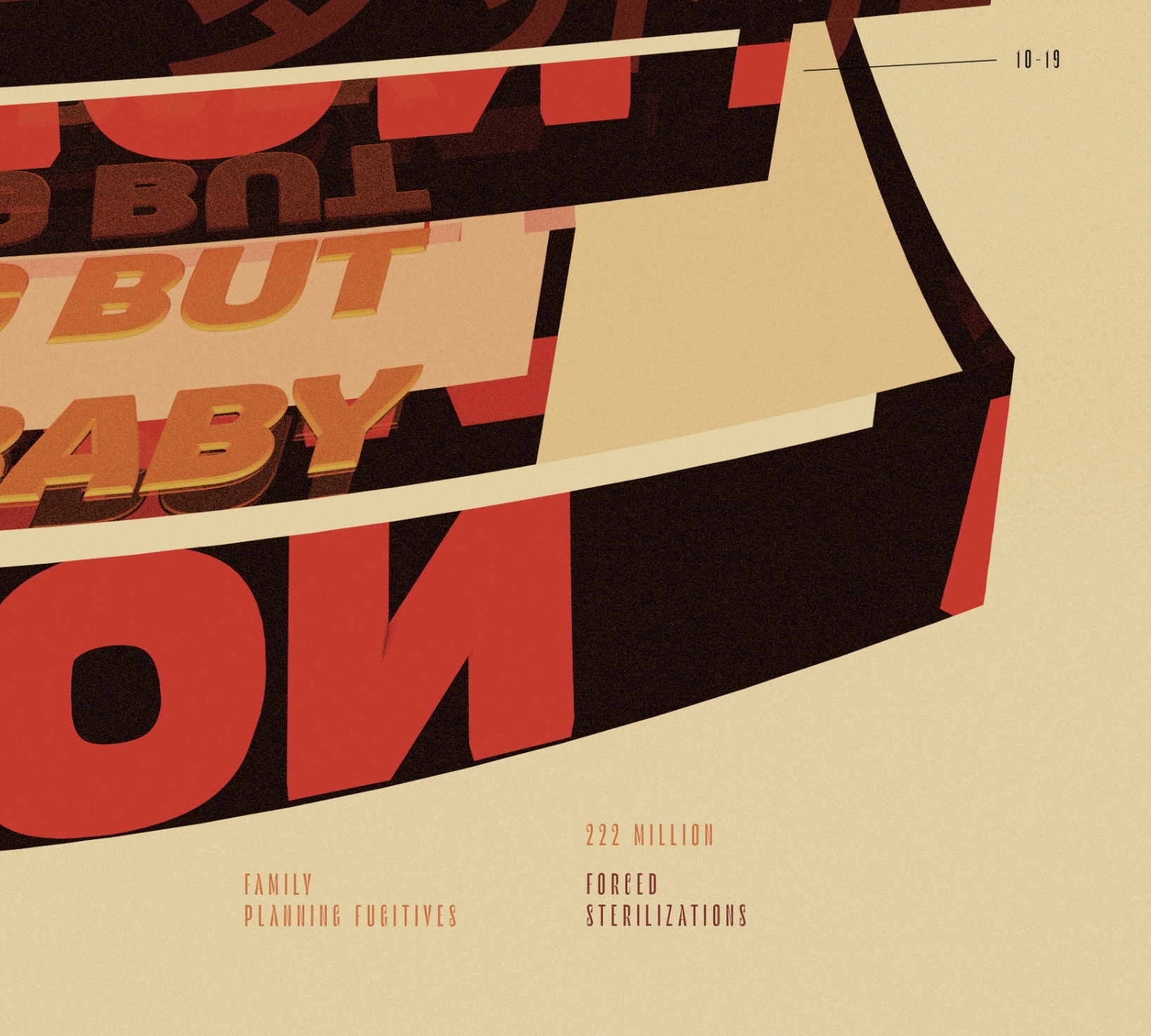
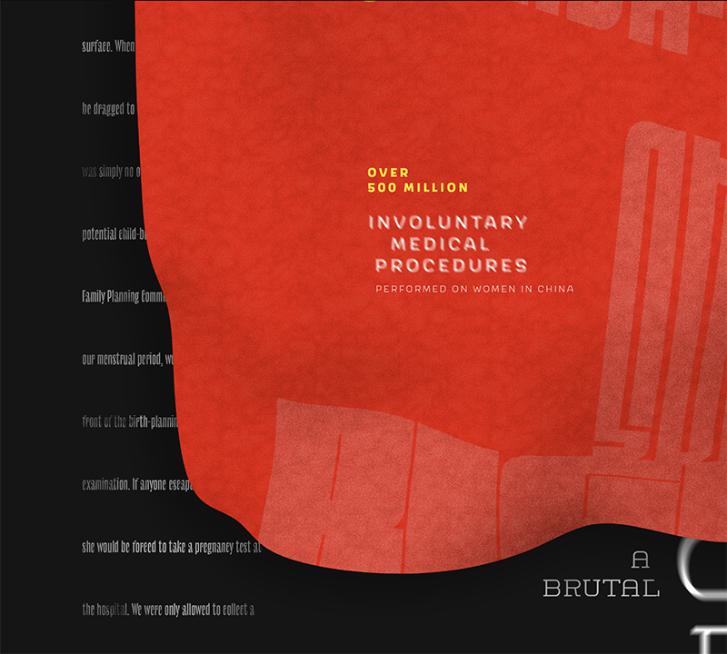
According to Chinese Health Ministry data, 336 million abortions and 222 million sterilizations have been carried out since 1971 under the one-child policy, many of which were non-consensual operations performed on women.
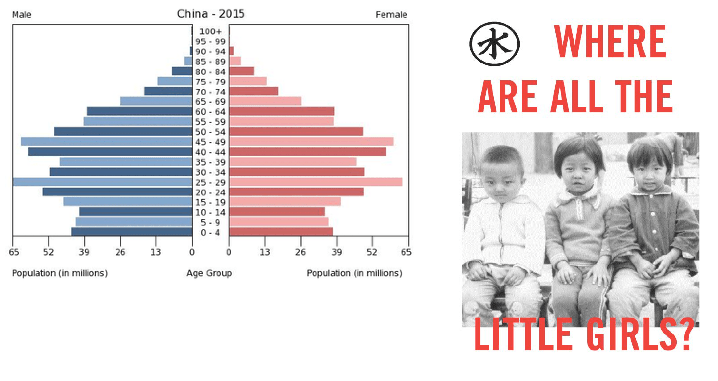
The population pyramid is a graph that shows the distribution of different age groups and is typically in the shape of a literal pyramid, but in China’s case it is turning upside down due to the country's overpopulation issue and the approaching underpopulation problem due to the one-child policy.
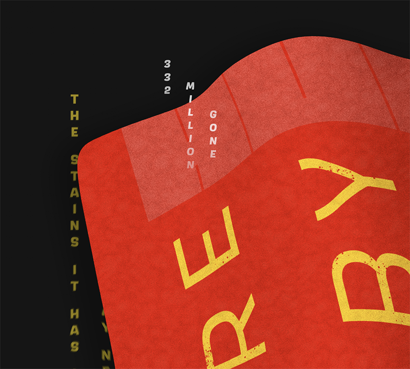
Now that the one-child policy has been relaxed, there are around 13 million unregistered children who were born without documentation during the 35 year policy reign. Registering as an official citizen costs thousands of dollars (in US equivalency) and is unaffordable for most of the people affected.
Visual Artifacts
Paperwork from the Chinese Family Planning Committee
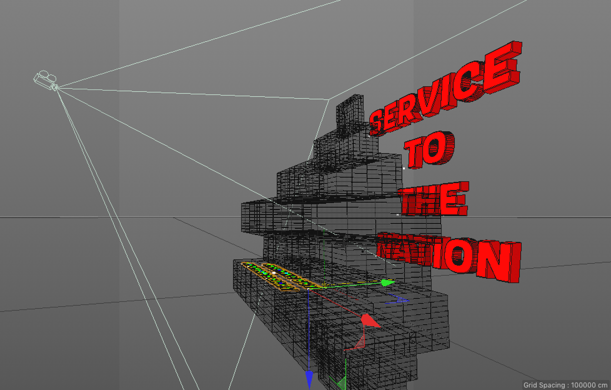
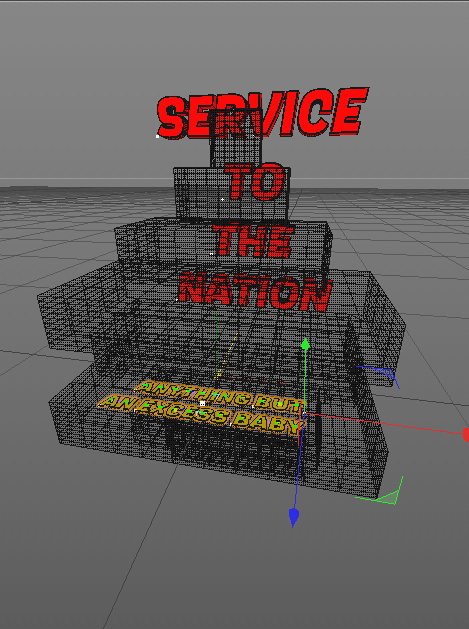
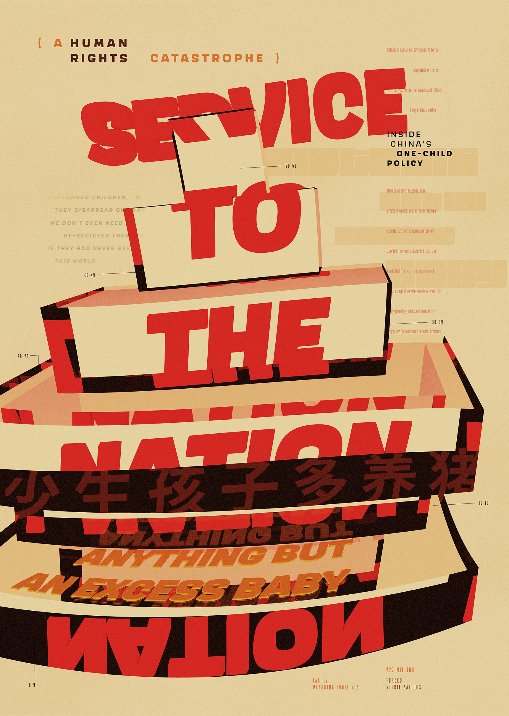
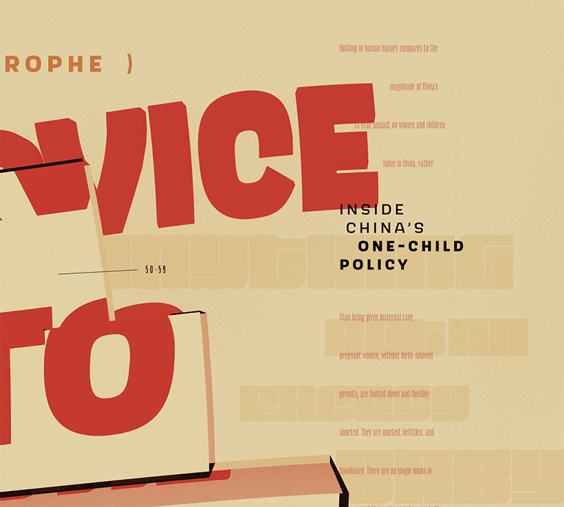
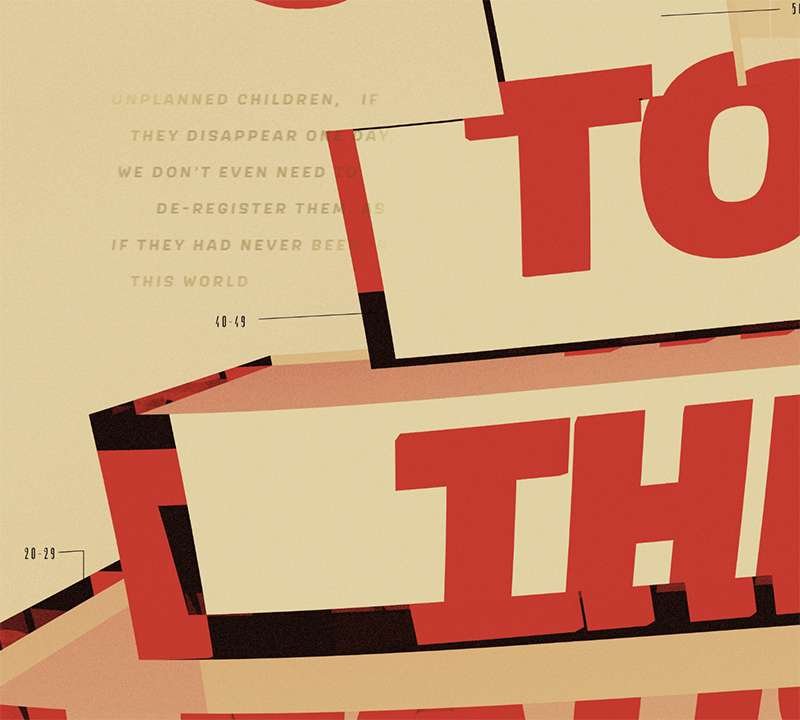
"Service to the Nation"
Concept
"Service to the nation" was one of the propoganda phrases circulated by China's government in order to justify the sterilizations and abortions performed on women during the one-child policy's active years; actions were deemed necessary in order to keep the population control.
For this poster, I constructed a three-dimensional population pyramid (the visualization of how a country's ideal population should look in terms of age groups) and then warped it to convey the problem of over-population and the subsequent issue of under-population that followed the decades of the one-child policy. I also applied a refractive index to this population chart and set the propoganda phrase "service to the nation" behind it so that the type would distort underneath the population chart. This also created interesting reversals of some of the phrases, espescially "nation" which appears upside-down further down in the poster.
Artwork Render
Final Poster
I superimposed two-dimensional type over the 3D render, and shifted the alignment so that the lines of text are in an inconsistent vertical rhythm that mimics the contours of the shifting population pyramid.
I also typeset most of the characters in all uppercase so that the lines of type would appear more boxy, the same way that Chinese characters appear in a more boxy configuration.
Details
"One More Tomb"
Concept
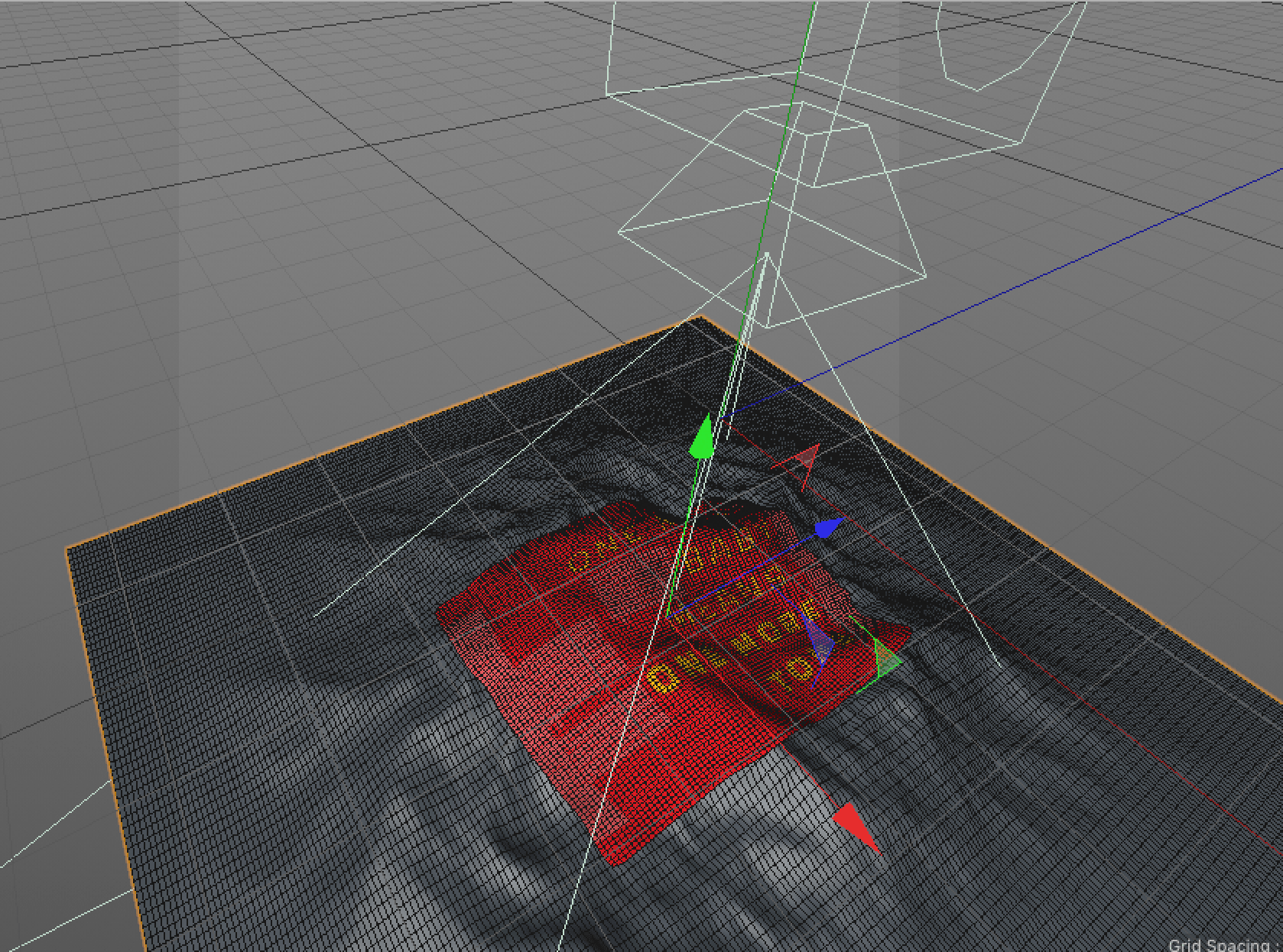
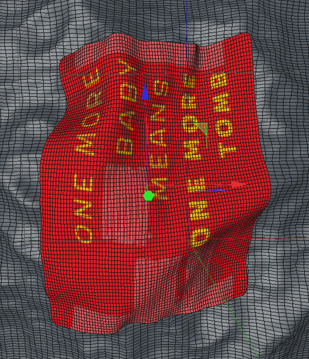
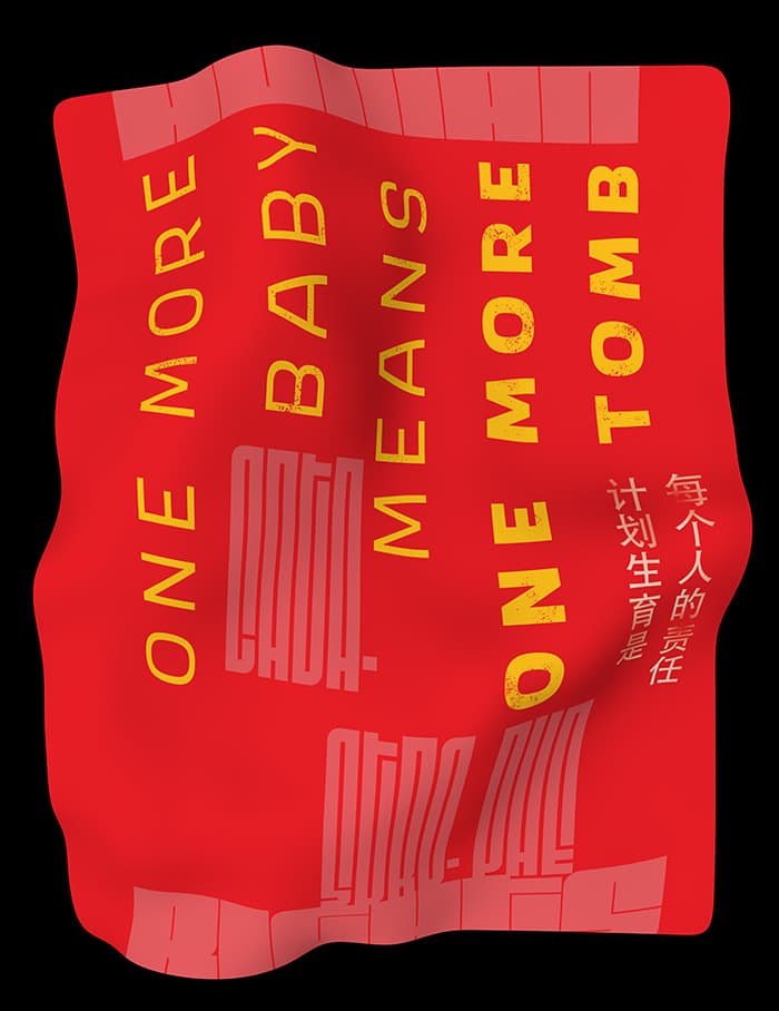
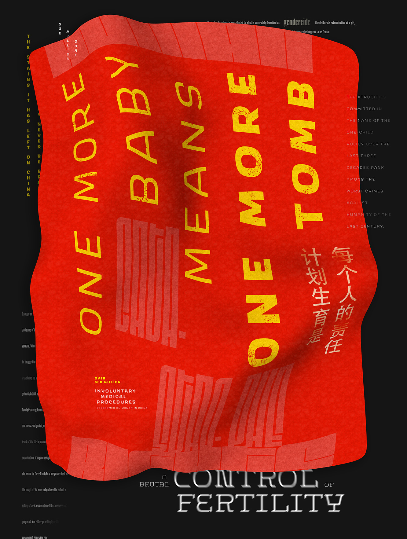
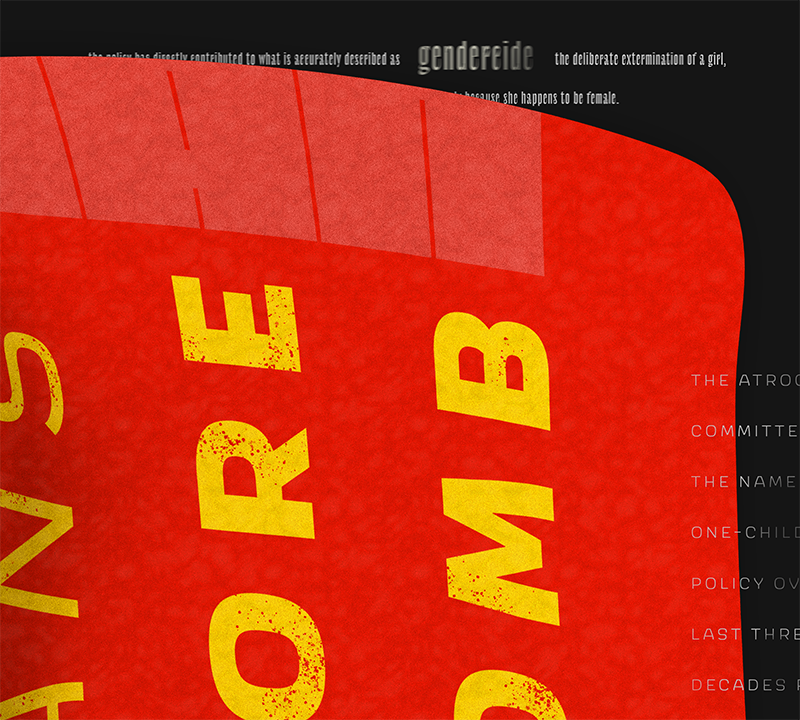
Grafitied onto a wall in China during the time of the one-child policy, the phrase "One more baby means one more tomb" is a shockingly accurate representation of the Chinese government's approach to children unapproved by the Family Planning Committee. For the artwork on this poster, I chose to simulate a falling cloth with those words superimposed onto it, which graphically resembles the Chinese flag and can simultaneously echo the look of an unused baby blanket.
Artwork Render
Final Poster
Details
Typeface Choices
My posters explore the one-child policy in China, an issue that receives harsh commentary from both the Western and Eastern hemispheres. This gave me the unique opportunity and challenge of balancing English type with the Chinese Hanzi characters. Ultimately, rather than relying on Hanzi glyphs themselves, I chose to use English characters that were typeset to resemble the flow and visual rhythm of Hanzi.
Scarlet
Jürgen Huber // supertype
Sans-serif typeface that has a curled hook on the end of the in-strokes and out-strokes of letterforms that mimics the curled feet of several common Hanzi characters.
The s, S, and g all make use of the same reversed proportion where the upper bowl/upper counter is significantly larger than the lower counter. This provides a slight deviation from typical Latin typography that assisted in my hinting of multi-language usage.
I also chose to typeset Scarlet exclusively in all caps, in order to create square forms that resembled the boxiness of Chinese characters.
Le Murmure
Jérémy Landes // commissioned by Murmure
Has warped proportions from typical Roman faces, and is much heavier and more condensed than Scarlet so that it contrasts well while providing another level of idiosyncrasy.
The in-strokes of the letterforms curl back into each other in a diagonal form, creating a unique contast of black and white form that begins to mimic the uneven and tightly-wound texture of the Hanzi glyphs.
Fit
David Jonathan Ross
An abstract display face meant to create texture rather than to be easily read; the width of this typeface grows by 3600% from the Skyline width to the Ultra Extended width.
Regardless of width, the internal spacing remains hairline thin and incredibly tight, which resembles the internal spacing found in many of the thick and square Chinese characters that combine multiple symbols into each glyph.
Discourse
Dave Bailey // Delve Fonts
The terminals of this typeface convey the sterileness of the topic.
Sharp prodding of the cap shapes that supports the emotion of the message being delivered about non-consensual medical procedures and forced sterilizations.
Width of the typeface also delivers the message in a colder and more dramatic way appropriate for a display headline.
Heiti
Adobe Originals
Each poster also has one usage of Chinese text, which were typeset in Adobe Heiti.
This is one of the Adobe original typefaces that came pre-imported through the Suite, which I chose to use as a non-native speaker of Chinese since I can't effectively evaluate more “indie” typefaces I found online.
Has a humanist but mostly mechanical feel that worked better for this topic, and the heavier weight of the face complemented my other English type choices well.